Popular Paint Colors for 2026: The Hues Defining Tomorrow’s Interiors
As we look toward 2026, the world of interior paint colors continues to evolve in exciting and meaningful ways. The colors we choose for our homes are never arbitrary; they respond to cultural shifts, technological advancements, and our collective emotional needs. The popular paint colors for 2026 reveal a fascinating portrait of our time—a desire for comfort and stability balanced with optimism and self-expression, a longing for connection to nature tempered with appreciation for technology, and a move toward authenticity that rejects cookie-cutter solutions in favor of personal meaning. This comprehensive guide explores the paint colors expected to dominate in 2026, helping you understand the directions color is taking and how you might incorporate these popular hues into your own home.
The Cultural Context of 2026 Color Trends
Before diving into specific colors, it is essential to understand the cultural forces shaping our color preferences. The colors we embrace in our homes reflect how we feel about the world and what we need from our personal spaces.
In 2026, we continue to process the profound shifts in how we live and work that began earlier in the decade. The lines between home, work, and sanctuary have blurred permanently, and our color choices reflect a desire for spaces that can accommodate multiple functions while providing emotional support. We seek colors that comfort without depressing, that energize without overwhelming, that express personality without screaming for attention.
Environmental consciousness continues to shape color trends, with increasing interest in hues drawn from the natural world. As climate concerns mount, we find solace in colors that connect us to earth, sky, and sea. This is not merely aesthetic; it is a psychological response to uncertainty, a reaching for grounding and stability through the colors that have surrounded humans for millennia.
Technology also influences color trends, both through the colors we see on our screens and through advances in paint technology itself. Digital life has trained our eyes to appreciate certain color relationships, while new pigment technologies allow for effects previously impossible. The popular colors of 2026 reflect this complex interplay between natural and digital worlds.
The Major Color Families of 2026
Several major color families emerge from the forecasts for 2026, each offering distinct possibilities for home interiors.
Grounded Greens
Green continues its reign as one of the most popular color families, but the greens of 2026 are deeper, more complex, and more grounded than their predecessors. These are not the bright, optimistic greens of previous years but hues that feel ancient, enduring, and connected to the natural world.
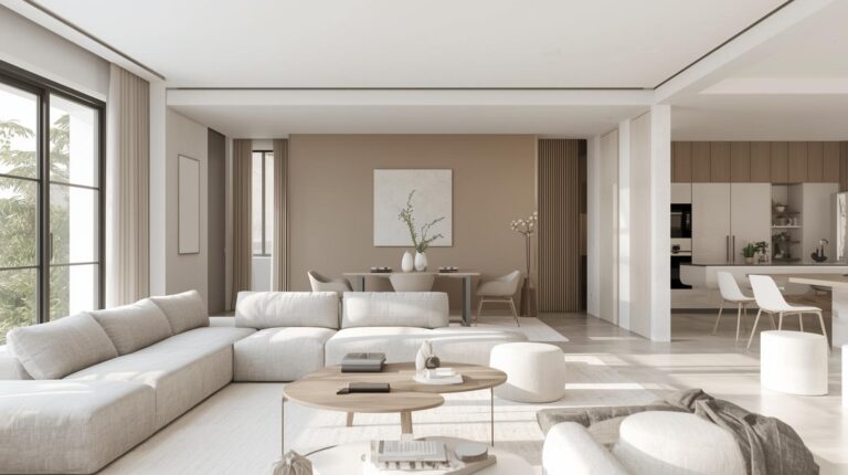
Sage green remains a favorite but in more sophisticated iterations with gray undertones that add complexity. These greens work beautifully in living rooms, bedrooms, and home offices, creating spaces that feel calm and connected to nature. They pair effortlessly with natural materials like wood, stone, and rattan.
Forest greens with blue undertones create dramatic, enveloping spaces perfect for libraries, dining rooms, and accent walls. These deep hues add sophistication and drama while maintaining the calming qualities that make green so beloved. When used in well-lit spaces, they create intimate, cocooning atmospheres.
Moss and lichen colors bring organic complexity to walls, their variegated quality adding depth that flat colors cannot match. These imperfect, nuanced greens appeal to those seeking authenticity and connection to the natural world. They work particularly well in casual spaces and rooms with abundant plants.
Tranquil Blues
Blue remains eternally popular, but the blues of 2026 lean toward the tranquil and restorative rather than the bright and energetic. These are colors for contemplation, for spaces where we recharge and restore after demanding days.
Powder blues with gray undertones create serene bedrooms and bathrooms. These soft, quiet hues promote relaxation without the clinical feel that some pale blues can have. They work beautifully with white trim and natural wood, creating spaces that feel fresh yet calm. The effect is reminiscent of clear skies and calm waters, bringing outdoor serenity indoors.
Dusty blues, sometimes called slate or denim, add sophistication while maintaining blue’s calming properties. These colors work well in living rooms and home offices, providing enough presence to feel intentional without overwhelming. They pair beautifully with warm woods and brass accents, creating spaces that feel both current and timeless.
Deep navy continues to be popular for dramatic spaces, but the navy of 2026 has complexity, subtle green or gray undertones that prevent it from feeling flat or one-dimensional. Used in libraries, dining rooms, or accent walls, these deep blues create intimate, cocooning spaces perfect for evening relaxation. They provide drama without sacrificing the calming qualities that make blue so beloved.
Warm Neutrals
The cool grays that dominated the previous decade have finally given way to warm neutrals that feel more human and welcoming. These colors provide the flexibility of neutrals with the warmth that makes spaces feel lived-in and loved.
Greige, that perfect blend of gray and beige, continues to evolve with warmer undertones that read more as warm gray than as beige. These colors provide sophisticated backdrops for virtually any style, from modern to traditional. They work in every room of the house, adapting to different functions with ease.
Taupe, with its complex blend of brown, gray, and sometimes purple undertones, adds richness to neutral palettes. These colors feel substantial and intentional, providing more character than standard beige while remaining flexible. Taupe works beautifully in living rooms and dining rooms, adding depth without drama.
Cream and ivory appear in warmer, richer iterations that feel cozy rather than sterile. These colors work beautifully in traditional and farmhouse interiors, creating inviting spaces that feel soft and welcoming. They reflect light beautifully while maintaining warmth that pure white sometimes lacks.
Muted Earth Tones
Beyond greens and browns, a broader range of earth tones emerges as popular in 2026. These colors, drawn from deserts, canyons, and mountains, bring the drama of natural landscapes indoors.
Terracotta and clay tones persist with greater sophistication. Adobe, sienna, and umber create warm, grounded spaces that feel connected to the earth without feeling primitive. These colors work particularly well in kitchens, dining rooms, and entryways, where their welcoming character shines. They pair beautifully with natural materials and create cozy, enveloping atmospheres.
Rust and ochre provide warm, energetic accents or dramatic wall colors. These hues add visual warmth to north-facing rooms and create cozy atmospheres in living spaces. Used thoughtfully, they bring the energy of desert landscapes into the home, creating spaces that feel both exotic and grounded.
Unexpected Accents
While main living spaces trend toward grounding neutrals, 2026 sees bold color appearing in unexpected places. Accent walls, interior doors, cabinets, and even ceilings become opportunities for self-expression.
Deep jewel tones, emerald, sapphire, amethyst, appear as accents against neutral backdrops. These rich colors add luxury and drama without overwhelming, their intensity balanced by surrounding calm. A single jewel-toned wall in a living room, jewel-toned kitchen cabinets, or a jewel-toned front door all create focal points that draw the eye.
Moody charcoals and almost-blacks create dramatic statements in libraries, dining rooms, and powder rooms. These deep colors make spaces feel intimate and sophisticated, particularly effective in rooms with good natural light. Used on ceilings, they create intimate, enveloping atmospheres that feel like cozy retreats.
The Color of the Year for 2026
Each year, major paint manufacturers announce Colors of the Year that often capture the zeitgeist. For 2026, these announcements will likely center on themes of renewal, grounding, and quiet confidence.
While specific colors vary by manufacturer, expect to see greens in the sage to forest range, blues with gray undertones, and warm, sophisticated neutrals dominating the selections. These colors reflect our collective desire for stability, connection to nature, and spaces that nurture rather than stimulate.
Several manufacturers have already hinted at directions. Benjamin Moore’s color forecasts suggest continued interest in complex greens and warm neutrals. Sherwin-Williams points toward grounded earth tones and restorative blues. PPG Paints emphasizes colors that promote well-being and connection to nature.
Watch for these announcements in late 2025, as they often set the tone for the year’s color conversations.
Popular Colors by Room
Different rooms invite different color approaches, and 2026 trends reflect this diversity.
Living Room Popular Colors
Living rooms in 2026 lean toward comforting, grounded hues that accommodate various activities. Warm greiges, dusty blues, and sage greens top the popularity charts, providing flexible backdrops for furnishings and family life. These colors support both quiet relaxation and lively entertaining, adapting to how the room is actually used.
For those seeking more drama, deeper forest greens and charcoals create intimate living spaces perfect for media rooms or formal entertaining. These enveloping colors make large rooms feel cozy and intentional, creating spaces where conversation flows easily.
Kitchen Popular Colors
Kitchen colors in 2026 continue the move away from all-white toward warmer, more personalized palettes. Sage green cabinets have become a classic choice, their connection to nature bringing calm to busy cooking spaces. Navy blue continues strong, particularly on lower cabinets paired with lighter uppers for balanced composition.
For walls, warm whites and creamy neutrals provide clean backdrops that allow cabinets and countertops to star. Pale blues and greens add color without overwhelming, creating kitchens that feel fresh and welcoming. Terracotta and clay tones appear on accent walls or islands, adding warmth and personality.
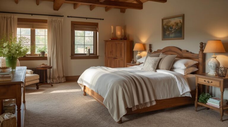
Bedroom Popular Colors
Bedrooms in 2026 embrace colors that promote rest and restoration. Tranquil blues in powder and dusty iterations create serene sleeping spaces that support healthy sleep patterns. Sage greens connect sleepers to nature, promoting renewal and calm. Warm neutrals provide grounding, flexible backdrops for personal expression through bedding and accessories.
For those who love deeper colors, charcoal and navy bedrooms create cozy, enveloping spaces that feel like retreats from the world. These dramatic hues work best in rooms with good natural light and ample artificial lighting for balance. Paired with soft textures and warm woods, they create luxurious sanctuaries.
Bathroom Popular Colors
Bathroom colors in 2026 lean toward spa-like tranquility. Soft blues and greens create calm, hygienic spaces that feel fresh and clean. These colors work particularly well in bathrooms, where their association with water and nature feels especially appropriate.
Warm neutrals provide sophisticated backdrops for tile and fixtures, allowing materials to shine. For drama, deeper colors in well-lit bathrooms create luxurious, enveloping spaces that feel like personal spas. Charcoal walls with white fixtures and brass accents create particularly striking combinations.
Home Office Popular Colors
Home offices in 2026 reflect their dual role as workspaces and parts of the home. Tranquil blues promote focus and concentration, ideal for analytical work and tasks requiring sustained attention. Sage greens provide balance and renewal, supporting creative thinking and preventing burnout.
Warm neutrals offer flexibility, allowing the space to adapt as work needs change. For those seeking energy, warm yellows and terracotta accents add optimism without the intensity that could prove distracting over long workdays. The key is creating a space that supports productivity while feeling like part of the home.
How to Incorporate 2026 Popular Colors
Understanding trends is one thing; applying them successfully in your own home requires thoughtful consideration.
Start Small
If you are intrigued by 2026 colors but hesitant to commit, start with small applications. An accent wall, a piece of furniture, or even accessories allow you to experiment with new colors without overwhelming your space. Live with these smaller applications for a while before considering larger commitments.
Consider Your Existing Elements
Popular colors should work with your existing flooring, cabinetry, and furnishings. A beautiful trend color that clashes with your oak floors or granite countertops will never feel right. Test samples near your fixed elements to ensure harmonious relationships before making final decisions.
Trust Your Instincts
Trends offer inspiration, not rules. The colors that feel right to you, that make you happy every time you see them, are always the right choice regardless of what is popular. Use trend information to expand your possibilities, not to limit them. Your home should please you first.
Think Long-Term
Major color commitments, whole rooms, kitchen cabinets, exterior paint, should stand the test of time. For these investments, lean toward classic colors that will please you for years, using trend colors for easily changed elements like accessories and accent walls. This approach gives you the best of both worlds, timeless foundations with room for seasonal expression.
Conclusion: The Colors of Tomorrow
The popular paint colors of 2026 reveal a world seeking balance between stimulation and calm, between self-expression and serenity, between the digital and the natural. The colors we bring into our homes reflect our deepest needs, for grounding in uncertain times, for connection to the natural world, for spaces that support our complex, multi-faceted lives.
Whether you embrace the tranquil blues, the grounded greens, the warm neutrals, or the unexpected accents, let your color choices be guided by what makes you feel truly at home. Popular colors offer inspiration, but your personal response to color is what ultimately matters. The right colors for your home are the ones that make you happy every time you walk through the door, that support how you actually live, that feel like you.
As you consider updating your home with the popular colors of 2026, take time to explore the new hues available, to test them in your spaces, to live with them before committing. The colors of tomorrow await, ready to transform your home into the sanctuary you need for the life you are living.