Paint Colors for Living Room: Transforming Your Heart of the Home
The living room holds a special place in any home. It is where families gather after long days, where friends are entertained, where children play, and where memories are made. As the heart of the home, the living room deserves particularly thoughtful consideration when it comes to paint color. The right hue can transform how this essential space feels, how light moves through it, and how you experience time spent there. From serene neutrals that recede peacefully to bold colors that make dramatic statements, from cool blues that promote calm to warm earth tones that envelop cozily, the options are nearly endless. Yet with thousands of colors available, choosing the right one for your living room can feel overwhelming. This comprehensive guide explores paint colors for living rooms, helping you navigate the selection process with confidence and create a space that truly feels like the heart of your home.
Understanding How Paint Color Affects Your Living Room
Before diving into specific color recommendations, it is essential to understand how paint color fundamentally affects our experience of living spaces. Color influences perception of size, mood, light, and even temperature, all of which matter in a room where you’ll spend countless hours.
Lighter colors make living rooms feel larger and more open by reflecting more light. They create the illusion of space, making walls recede and ceilings feel higher. Darker colors do the opposite, making rooms feel more intimate and cozy but potentially smaller. This doesn’t make dark colors wrong for living rooms; it simply means they should be used intentionally based on your goals for the space.
Color also affects how we perceive light. Cool colors—blues, greens, and purples—tend to recede, making spaces feel more open. Warm colors—reds, oranges, and yellows—advance, making spaces feel more enclosed. A north-facing living room with cool light might benefit from warm colors that compensate; a sun-drenched south-facing room might welcome cool colors that balance the warmth.
The psychological effects of color are equally significant in living rooms, where you’ll engage in various activities from quiet reading to lively entertaining. Blues promote calm and relaxation, making them ideal for spaces where you unwind. Yellows energize and uplift, bringing sunshine even on cloudy days. Greens connect us to nature, creating feelings of renewal and balance. Neutrals provide grounding and flexibility, allowing furniture and accessories to take center stage.
Factors to Consider Before Choosing Living Room Colors
Several important factors should guide your color selection before you ever open a paint deck.
Room Size and Layout
The size of your living room significantly influences which colors will work best. Small living rooms benefit from light, cool colors that make spaces feel larger. Pale blues, soft greens, and light grays recede visually, creating the illusion of more space. White remains the most effective space-expander, reflecting maximum light and making walls recede.
Large living rooms can accommodate deeper, richer colors that would overwhelm smaller spaces. Dark blues, forest greens, and charcoals create intimate atmospheres in generously proportioned rooms, making them feel cozy rather than cavernous. Consider using deeper colors on all walls for enveloping effect, or reserve them for accent walls to create focal points.
Natural Light
The amount and quality of natural light your living room receives dramatically affects how colors appear. North-facing rooms receive cool, consistent light that can make colors appear more blue or gray than expected. These spaces benefit from warm colors with yellow or red undertones that compensate for the cool light.
South-facing rooms receive warm, abundant light that intensifies colors and can make them appear brighter. These spaces can handle cooler colors that balance the warmth, as well as deeper shades that won’t feel oppressive in the bright light.
East-facing rooms receive warm morning light and cooler afternoon light, creating color shifts throughout the day. West-facing rooms receive cool morning light and warm, intense afternoon light. Test samples at multiple times in these rooms to ensure satisfaction throughout the day.
Existing Elements
Consider fixed elements that will remain in your living room. Flooring color significantly affects how wall colors appear. Hardwood floors in warm tones may clash with cool wall colors; neutral floors offer more flexibility. Fireplace materials, built-ins, and large furniture pieces all influence color relationships.
Work with these elements rather than against them. Choose paint colors that complement your existing features. Test samples near these elements to ensure harmonious relationships.
Room Function
Consider how you actually use your living room. Is it primarily for quiet relaxation, for lively entertaining, for family movie nights, or for all of the above? A room for calm activities benefits from soothing colors. A space for social gatherings can handle more energizing hues. Versatile spaces may benefit from neutral backdrops with colorful accents that can change with seasons or moods.
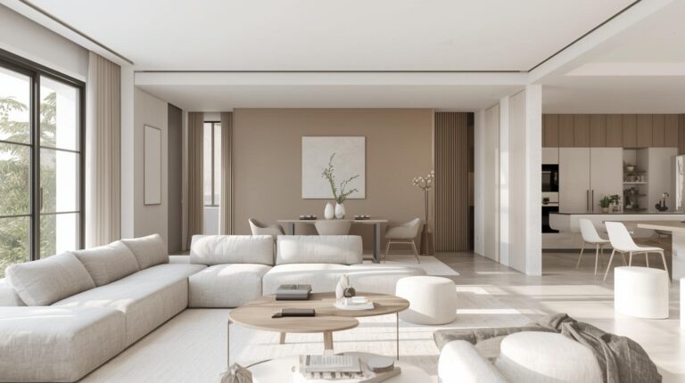
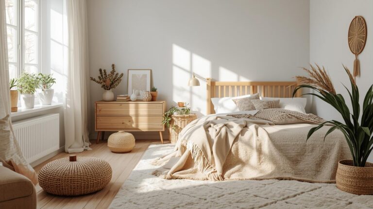
Neutral Paint Colors for Living Rooms
Neutrals form the foundation of countless living rooms for good reason. They provide flexibility, allowing furniture and accessories to change without repainting. They create calm, uncluttered backdrops that make spaces feel larger. And they work with virtually any design style, from traditional to modern to eclectic.
White and Off-White
White remains the most popular living room color for its versatility and light-reflecting properties. White walls make rooms feel larger and brighter, providing a clean canvas for artwork, furniture, and accessories. White also allows architectural details to shine, with moldings and trim gaining definition against white backgrounds.
Not all whites are equal. Pure white can feel stark, particularly in rooms with limited natural light. Warm whites with cream or yellow undertones create cozier atmospheres. Cool whites with gray or blue undertones feel crisp and modern. Popular whites for living rooms include Benjamin Moore’s Simply White (warm), Sherwin-Williams’s Pure White (balanced), and Farrow & Ball’s Wimborne White (classic).
Off-whites, including ivory, cream, and ecru, add warmth while maintaining lightness. These colors work beautifully in traditional and farmhouse living rooms, creating inviting backdrops that feel soft and welcoming.
Gray
Gray has become a staple of contemporary living rooms for its sophisticated neutrality. From pale silver to soft charcoal, gray offers endless possibilities for creating calm, refined spaces. Warm grays with brown or beige undertones create cozy atmospheres. Cool grays with blue undertones feel crisp and modern.
Gray works beautifully as a backdrop for colorful furnishings, allowing brighter pieces to pop. It also pairs elegantly with other neutrals, white trim, natural wood tones, and black accents. Popular grays for living rooms include Benjamin Moore’s Revere Pewter (warm), Sherwin-Williams’s Agreeable Gray (balanced), and Farrow & Ball’s Cornforth White (cool).
The key lies in choosing the right undertone. Gray that reads slightly blue may clash with warm wood floors; gray with purple undertones may feel unexpected against certain furnishings. Test samples near your fixed elements before committing.
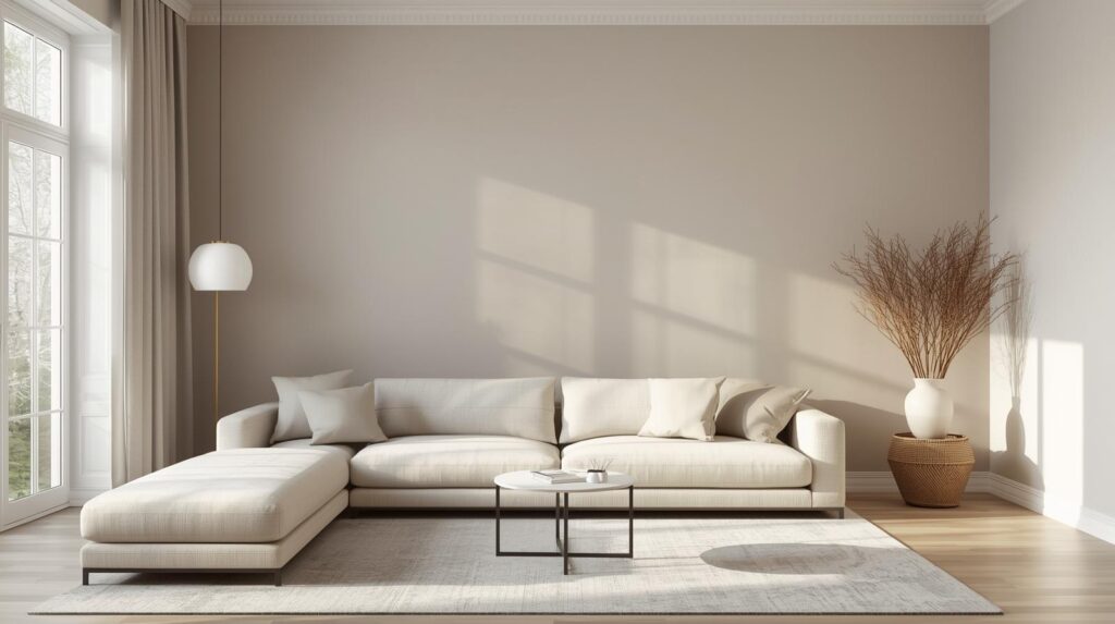
Beige and Greige
Beige, long dismissed as boring, has experienced a renaissance in recent years. Modern beiges have greater depth and complexity than their 1990s predecessors, with undertones that add richness without reading as yellow or pink. These colors create warm, inviting living rooms that feel grounded and natural.
Greige, a blend of gray and beige, offers the best of both worlds. These colors have the sophistication of gray with the warmth of beige, creating versatile neutrals that work in almost any living room. Greige walls provide calm backdrops that change subtly throughout the day as light shifts.
Taupe
Taupe, with its complex blend of brown, gray, and sometimes purple undertones, adds sophistication to living rooms. These colors feel richer than standard beige while remaining neutral enough for flexibility. Taupe works beautifully in traditional living rooms, adding depth without drama, and in modern spaces seeking warmth without color.
Cool Paint Colors for Living Rooms
Cool colors—blues, greens, and purples—create calm, restful living spaces ideal for relaxation and quiet conversation.
Blue
Blue consistently ranks as the most popular living room color, and for good reason. This versatile hue ranges from pale sky to deep navy, offering options for every style and space. Blue promotes calm and relaxation, making it ideal for living rooms where unwinding is the goal.
Pale blues create airy, open feelings, making small living rooms feel larger. These soft hues work beautifully with white trim and natural wood tones, creating spaces that feel fresh and serene. Popular choices include Benjamin Moore’s Breath of Fresh Air and Sherwin-Williams’s Rainwashed.
Medium blues, like periwinkle or classic colonial blue, add more presence while maintaining calm. These colors work well in living rooms with good natural light, where they can show their full character. Pair with crisp white trim and touches of yellow or green for balanced compositions.
Deep blues, navy and indigo, create dramatic, enveloping living spaces perfect for media rooms or intimate conversation areas. These colors make walls feel closer, creating cozy cocoons that promote relaxation. Use in larger living rooms or on accent walls to avoid overwhelming smaller spaces.
Green
Green connects us to nature, creating feelings of renewal, balance, and calm that suit living rooms beautifully. From pale sage to deep forest, green offers options for every style.
Sage green, with its gray undertones, provides subtle color that feels both natural and sophisticated. These walls work beautifully in living rooms seeking calm color without drama. Pair with white trim, natural wood, and touches of cream for serene compositions. Popular choices include Benjamin Moore’s October Mist and Sherwin-Williams’s Evergreen Fog.
Olive and moss greens bring more saturation while maintaining connection to nature. These earthy tones work well in living rooms with plants and natural materials, creating cohesive indoor-outdoor connections. Leather, wood, and natural fibers complement these colors beautifully.
Emerald and forest greens make dramatic statements in larger living rooms. These deep hues create luxurious, enveloping spaces perfect for formal living areas or rooms with abundant natural light. Gold accents and rich woods complement these colors beautifully.
Purple and Lavender
Purple, used thoughtfully, adds unexpected sophistication to living rooms. Pale lavender creates soft, romantic spaces that feel fresh and modern. These walls work beautifully with gray and white trim, creating calm, sophisticated rooms that avoid typical purple pitfalls.
Deeper plums and eggplants create dramatic, luxurious living spaces perfect for formal rooms. These rich hues envelop rooms in warmth, creating intimate atmospheres ideal for evening entertaining. Gold and brass accents complement these colors beautifully.
Warm Paint Colors for Living Rooms
Warm colors—reds, oranges, and yellows—create energetic, welcoming living spaces ideal for entertaining and family gatherings.
Yellow
Yellow brings sunshine into living rooms, creating spaces that feel cheerful and welcoming. From pale butter to bold gold, yellow offers options for every style.
Pale yellows, like buttercream or vanilla, add warmth without overwhelming. These soft hues work beautifully in north-facing living rooms needing visual warmth, creating cozy atmospheres even on gray days. White trim keeps the look fresh and clean. Popular choices include Benjamin Moore’s Hawthorne Yellow and Sherwin-Williams’s Buttered Yam.
Medium yellows, like honey or marigold, bring more energy while remaining approachable. These colors work well in living rooms where lively entertaining happens, adding welcoming energy. Pair with gray or blue accents for balanced compositions.
Deep golds create dramatic, luxurious living spaces perfect for formal rooms or accent walls. These rich hues add warmth and sophistication, particularly effective in rooms with evening use. Jewel tones and metallics complement these colors beautifully.
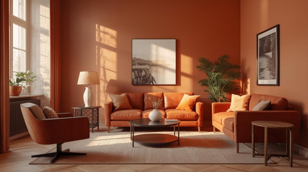
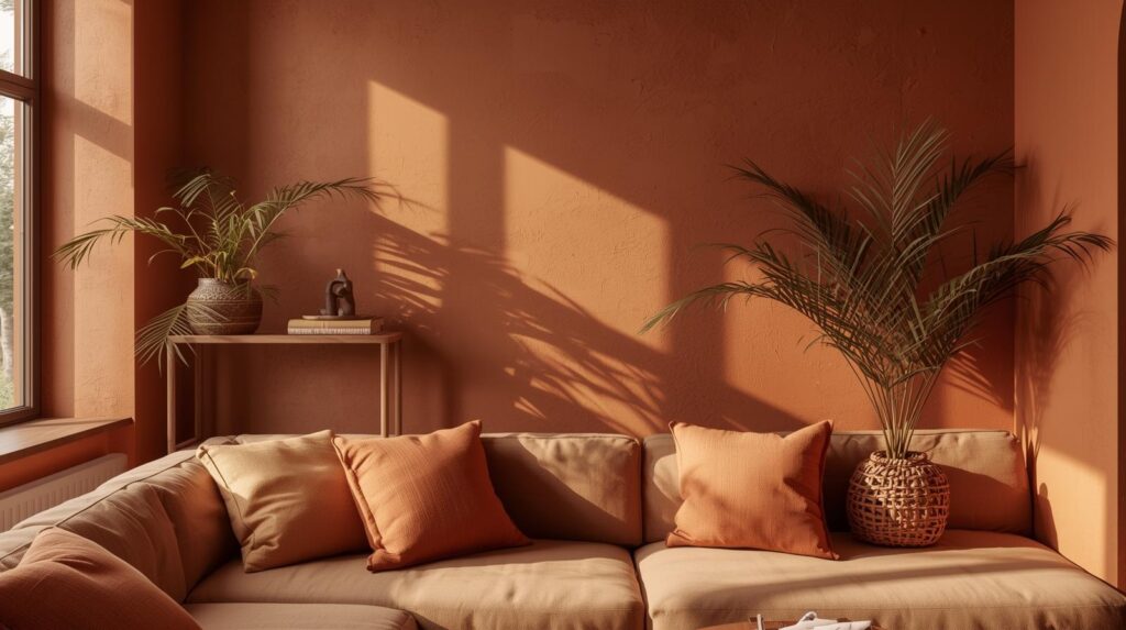
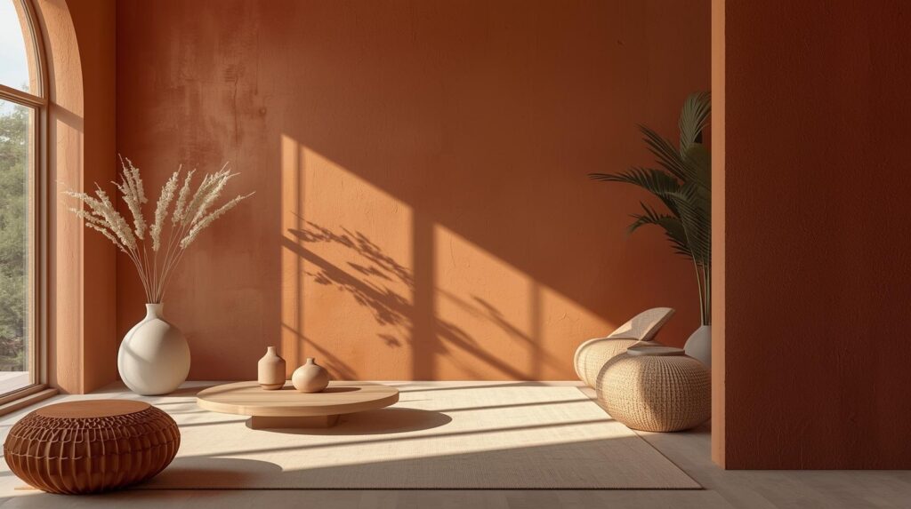
Orange and Terracotta
Orange, used thoughtfully, adds warmth and energy to living rooms. Terracotta and burnt orange, with their earthy undertones, prove particularly popular for their natural, grounded quality.
Terracotta walls create warm, enveloping living spaces that feel connected to the earth. These colors work beautifully in Southwestern, Mediterranean, and bohemian living rooms, adding authentic character. Natural materials—wood, stone, and woven textures—complement terracotta perfectly. Popular choices include Farrow & Ball’s Terracotta and Benjamin Moore’s Burnt Orange.
Peach and apricot offer softer orange options with less intensity. These warm, welcoming hues work well in living rooms seeking color without drama. Pair with cream and natural wood for fresh, modern compositions.
Red
Red, used sparingly, adds drama and energy to living rooms. Deep burgundies and wine shades create luxurious, intimate spaces perfect for formal living areas. These rich hues envelop rooms in warmth, creating dramatic backdrops for traditional furnishings.
Brick reds offer more casual options with earthy undertones. These colors work well in rustic, farmhouse, and industrial living rooms, adding warmth without formality. Natural materials and textures complement these colors beautifully.
Use red thoughtfully; as the most intense color, it can overwhelm if overused. Consider accent walls or living rooms with abundant natural light where red can show its full character without dominating.
Earth Tone Paint Colors for Living Rooms
Earth tones—drawing inspiration from soil, clay, and stone—create grounded, natural living spaces that feel warm and authentic.
Brown and Tan
Brown, in its many variations, creates warm, stable living spaces that feel grounded and secure. From pale sand to rich chocolate, brown offers options for every style.
Light tans and sands create warm neutrals that work beautifully in casual living rooms. These colors feel natural and approachable, providing flexible backdrops for various furnishings. Pair with white trim for freshness or wood tones for warmth.
Medium browns, like caramel or walnut, add richness while maintaining neutrality. These colors work well in traditional and rustic living rooms, creating warm, enveloping atmospheres. Cream and gold accents complement these colors beautifully.
Clay and Adobe
Clay and adobe tones, with their reddish undertones, bring warmth and authenticity to living rooms. These colors, inspired by Southwestern and Mediterranean landscapes, create spaces that feel connected to the earth.
Clay walls work beautifully with natural materials—wood, stone, and woven textures—creating cohesive, grounded living spaces. White or cream trim keeps the look fresh while allowing the wall color to shine.
Living Room Paint Color by Room Characteristics
Beyond personal preference, your living room’s physical characteristics should influence color choice.
Small Living Rooms
Small living rooms benefit from light, cool colors that make spaces feel larger. Pale blues, soft greens, and light grays recede visually, creating the illusion of more space. White remains the most effective space-expander, reflecting maximum light and making walls recede.
Consider painting ceiling and walls the same light color to eliminate visual boundaries, making rooms feel larger. Trim in the same color, perhaps slightly glossier, maintains flow while adding subtle definition.
Large Living Rooms
Large living rooms can accommodate deeper, richer colors that would overwhelm smaller spaces. Dark blues, forest greens, and charcoals create intimate atmospheres in generously proportioned rooms, making them feel cozy rather than cavernous.
Consider using deeper colors on all walls for enveloping effect, or reserve them for accent walls to create focal points. Large rooms also accommodate color zoning—different colors for different functional areas within the same open space.
Living Rooms with Limited Natural Light
North-facing and other low-light living rooms benefit from warm colors that compensate for cool, limited light. Pale yellows, warm creams, and soft peaches add visual warmth that makes these spaces feel more inviting. Avoid cool colors that can feel cold and uninviting in low light.
Consider using lighter values of warm colors to maximize light reflection. Glossier finishes also help bounce available light around the room.
Living Rooms with Abundant Natural Light
Sun-drenched living rooms can handle a wider color range, including deeper hues that might feel heavy in darker spaces. Bright southern exposure allows colors to show their true character, making even deep blues and greens feel fresh and alive.
Consider how colors change throughout the day as light shifts. A color that looks perfect at noon may appear very different at sunset. Test samples and observe at multiple times before committing.
Accent Walls and Color Placement in Living Rooms
Beyond overall wall color, strategic color placement creates interest and defines spaces in living rooms.
Accent Walls
A single wall in a contrasting color creates focal points and adds drama without overwhelming. The wall behind a sofa, the wall with a fireplace, or the wall opposite the entry often work best for accent treatment.
Choose accent colors that relate to your overall palette—perhaps a deeper version of your main color or a complementary hue. The accent should feel intentional, not random.
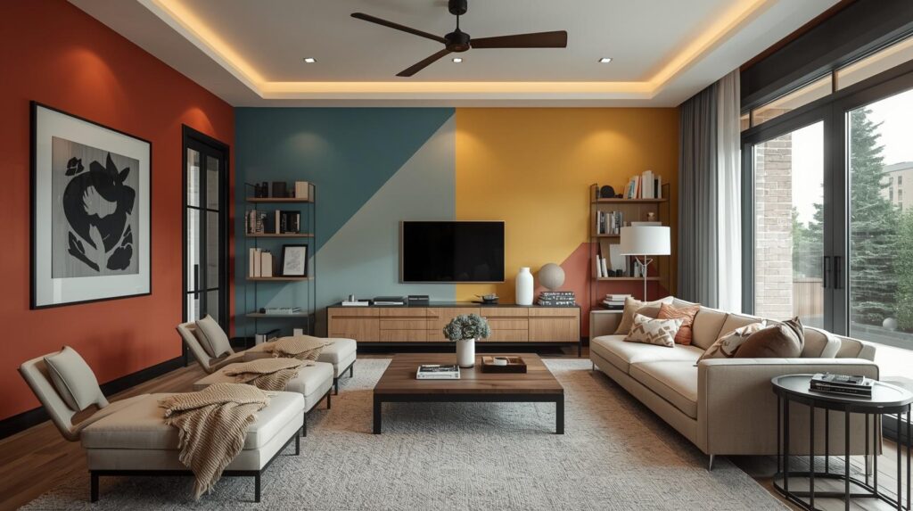
Color Blocking
Color blocking uses multiple colors in geometric arrangements for modern, graphic effect. This approach works best in contemporary living rooms with clean lines and minimal furnishings. Professional painting ensures crisp edges essential to successful color blocking.
Ceiling Color
Ceilings, often overlooked, offer opportunities for color expression. A lighter version of wall color creates cohesive, enveloping spaces. A contrasting color, perhaps a soft blue for sky effect or a warm color for intimacy, adds interest overhead. White ceilings remain classic for their light-reflecting properties.
Testing and Committing
Before committing to a living room color, proper testing prevents costly mistakes.
Sample Painting
Paint large samples directly on your walls, at least 12-inch squares, and observe at different times of day. Colors look different in morning, midday, and evening light. Artificial lighting also affects appearance; observe under your typical evening lighting as well.
Consider Undertones
Every color has undertones that become apparent next to other colors. A gray may read slightly blue next to warm wood, slightly green next to certain fabrics. Test your color near fixed elements that will remain—flooring, fireplace, large furniture pieces.
Live with Samples
Live with your samples for several days before deciding. Notice how you feel about the color at different times, in different moods. The right color should feel comfortable consistently, not just look good in photographs.
Conclusion: The Power of Living Room Paint
Living room paint colors profoundly affect how you experience your home’s most important space. The right color supports relaxation, encourages conversation, and creates a backdrop that enhances everything else in the room. The wrong color, however beautiful in isolation, can feel uncomfortable and wrong.
Take time with your living room color selection. Consider how you use the space, what feeling you want to create, how light affects the room. Test samples thoroughly and live with them before committing. Trust your instincts; the color that feels right to you is likely the right choice, regardless of trends or others’ opinions.
Whether you choose serene blue, warm terracotta, sophisticated gray, or crisp white, your living room paint color sets the stage for life lived within its walls. Choose thoughtfully, and you’ll create a space that welcomes you home for years to come.