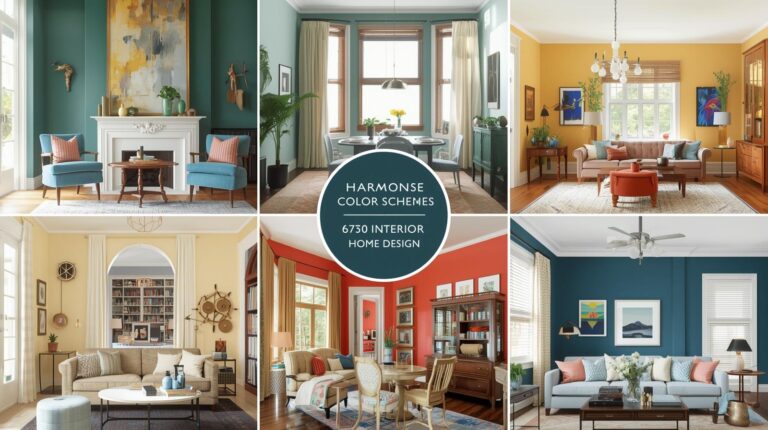
Neutral Paint Colors for Whole House: Creating Cohesive, Calm Living Spaces
There is something profoundly satisfying about walking through a home where the colors flow seamlessly from room to room. Each space feels connected to the next, yet distinct enough to serve its purpose. This harmonious effect is the hallmark of a well-planned neutral palette applied throughout the entire house. Neutral paint colors for whole house schemes have become increasingly popular for good reason. They create calm, cohesive environments that feel larger, more intentional, and infinitely adaptable. Whether you prefer warm, cool, or somewhere in between, neutral palettes provide the foundation for homes that evolve with you over time. This comprehensive guide explores neutral paint colors for whole house applications, helping you create spaces that feel connected, calm, and beautifully livable.
The Appeal of Whole-House Neutral Palettes
Before diving into specific colors, it is worth understanding why so many homeowners choose to use neutrals throughout their entire home.
Creating Visual Flow
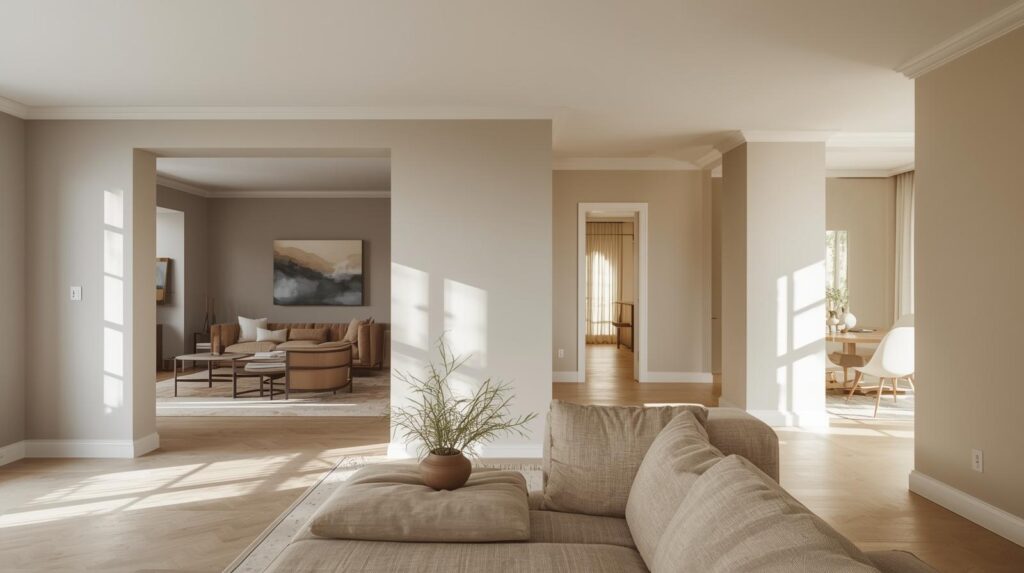
When colors transition smoothly from room to room, your home feels larger and more intentional. There are no jarring shifts that stop the eye or create visual chaos. Instead, each space leads naturally to the next, creating a journey through your home that feels cohesive and considered.
This flow is particularly important in open-concept homes where multiple spaces share visual connection. A kitchen that flows into a dining area that flows into a living room requires color relationships that work across all three. Whole-house neutrals solve this challenge elegantly.
Flexibility and Adaptability
Neutral palettes provide the ultimate flexibility. As your tastes evolve, as seasons change, as you acquire new furniture or artwork, your wall colors continue to work. Accent colors can shift dramatically without requiring repainting. A room that feels coastal with blue accents one year can feel rustic with terracotta the next, all while the walls remain the same.
This adaptability proves particularly valuable for homeowners who enjoy changing their decor or who plan to stay in their homes for many years. Neutral walls become constants that support rather than limit evolution.
Enhanced Resale Value
While your home should please you first, neutral palettes also appeal to the widest range of potential buyers when it comes time to sell. Bold, personal colors that you love may limit your market. Neutral walls allow buyers to imagine their own possessions and style in the space, making your home more marketable.
Emphasis on Architecture and Furnishings
Neutral walls recede, allowing architectural details, artwork, and furnishings to take center stage. Beautiful moldings, interesting furniture, and cherished collections all stand out against neutral backdrops. Your investments in these elements become more visible and appreciated.
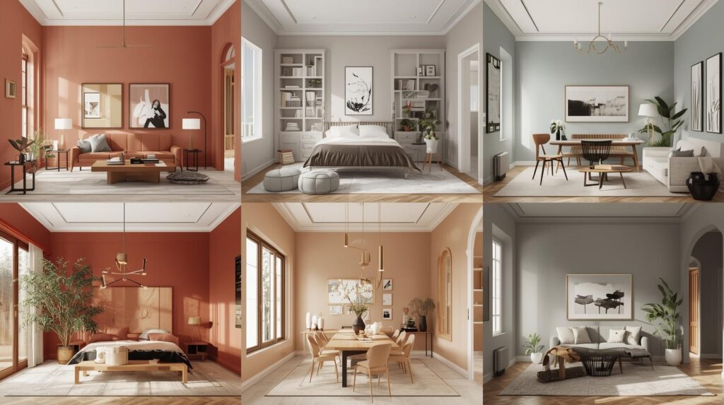
Understanding Undertones in Neutrals
The most challenging aspect of working with neutrals lies in understanding undertones. Every neutral has an underlying color bias that affects how it reads and how it relates to other colors.
Warm Neutrals
Warm neutrals have yellow, red, or orange undertones. They include cream, beige, taupe, and warm grays (sometimes called greige). These colors create cozy, inviting spaces that feel grounded and welcoming. They work particularly well in north-facing rooms that lack natural warmth.
Warm neutrals pair beautifully with other warm colors and with natural materials like wood, stone, and leather. They can, however, clash with cool colors if not carefully chosen. A warm beige next to a cool blue may create an unintentional contrast.
Cool Neutrals
Cool neutrals have blue, green, or purple undertones. They include pure white, cool grays, and some greiges that lean gray rather than brown. These colors create crisp, clean spaces that feel fresh and modern. They work particularly well in south-facing rooms where they balance abundant warm light.
Cool neutrals pair beautifully with other cool colors and with metallics like chrome and nickel. They can feel stark in rooms with limited natural light if not warmed with textiles and accessories.
True Neutrals
True neutrals have no discernible undertone, appearing perfectly balanced between warm and cool. Pure white with no tint, true gray, and black fall into this category. These colors offer maximum flexibility, working with virtually any other color.
True neutrals can, however, feel flat or sterile if used exclusively. They benefit from textural interest and carefully chosen accents to bring spaces to life.
Selecting Your Whole-House Neutral Palette
Choosing neutrals for an entire home requires considering how colors will work together across multiple spaces.
Start with Fixed Elements
Your neutral palette must work with elements that cannot easily change. Flooring, countertops, cabinetry, and tile all have colors that will remain. Choose wall colors that complement these permanent features rather than fighting them.
If you have warm oak floors, cool gray walls may clash. If you have cool marble countertops, warm beige walls may feel disconnected. Test samples near your fixed elements before committing to any color.
Consider Light Throughout Your Home
Different rooms receive different light throughout the day. A color that looks perfect in your south-facing living room may appear completely different in your north-facing bedroom. Test your chosen colors in multiple rooms before finalizing your palette.
Consider creating a palette with slight variations for different exposures. A warm neutral that works in north-facing rooms may be too warm for south-facing spaces where a cooler version would balance better.
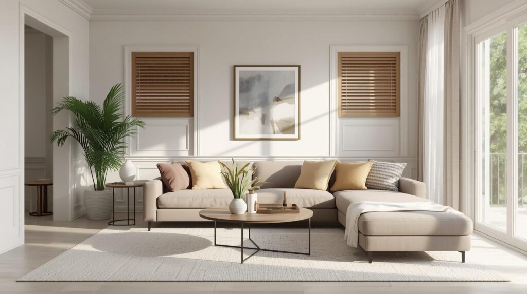
Create a Cohesive Palette
A whole-house neutral palette typically includes several related colors. You might choose a main color for most walls, a slightly lighter version for trim, a slightly darker version for accent walls, and perhaps a related neutral for spaces that feel different, like bathrooms.
These colors should relate through shared undertones. All should lean warm together or cool together to maintain cohesion. Mixing warm and cool neutrals throughout your home creates visual chaos rather than flow.
Popular Whole-House Neutral Colors
Several neutral families have proven particularly successful for whole-house applications.
Warm White and Off-White
White remains the most popular whole-house neutral for its versatility and light-reflecting properties. Not all whites are equal, and choosing the right white matters enormously.
Pure white can feel stark, particularly in rooms with limited natural light. Warm whites with cream or yellow undertones create cozier atmospheres. Popular warm whites include Benjamin Moore’s White Dove and Sherwin-Williams’s Alabaster. These colors read as white while providing warmth that feels inviting rather than clinical.
Cool whites with gray or blue undertones feel crisp and modern. Benjamin Moore’s Chantilly Lace and Sherwin-Williams’s Pure White offer clean, fresh options that work beautifully in contemporary homes.
Off-whites, including ivory and cream, add more warmth while maintaining lightness. These colors work beautifully in traditional and farmhouse homes, creating inviting backdrops that feel soft and welcoming.
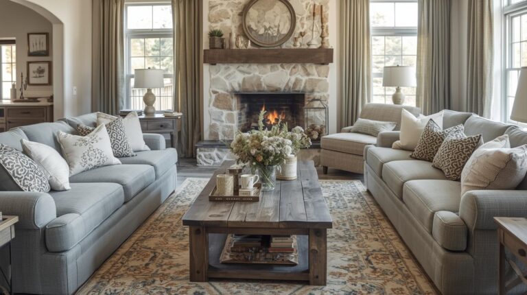
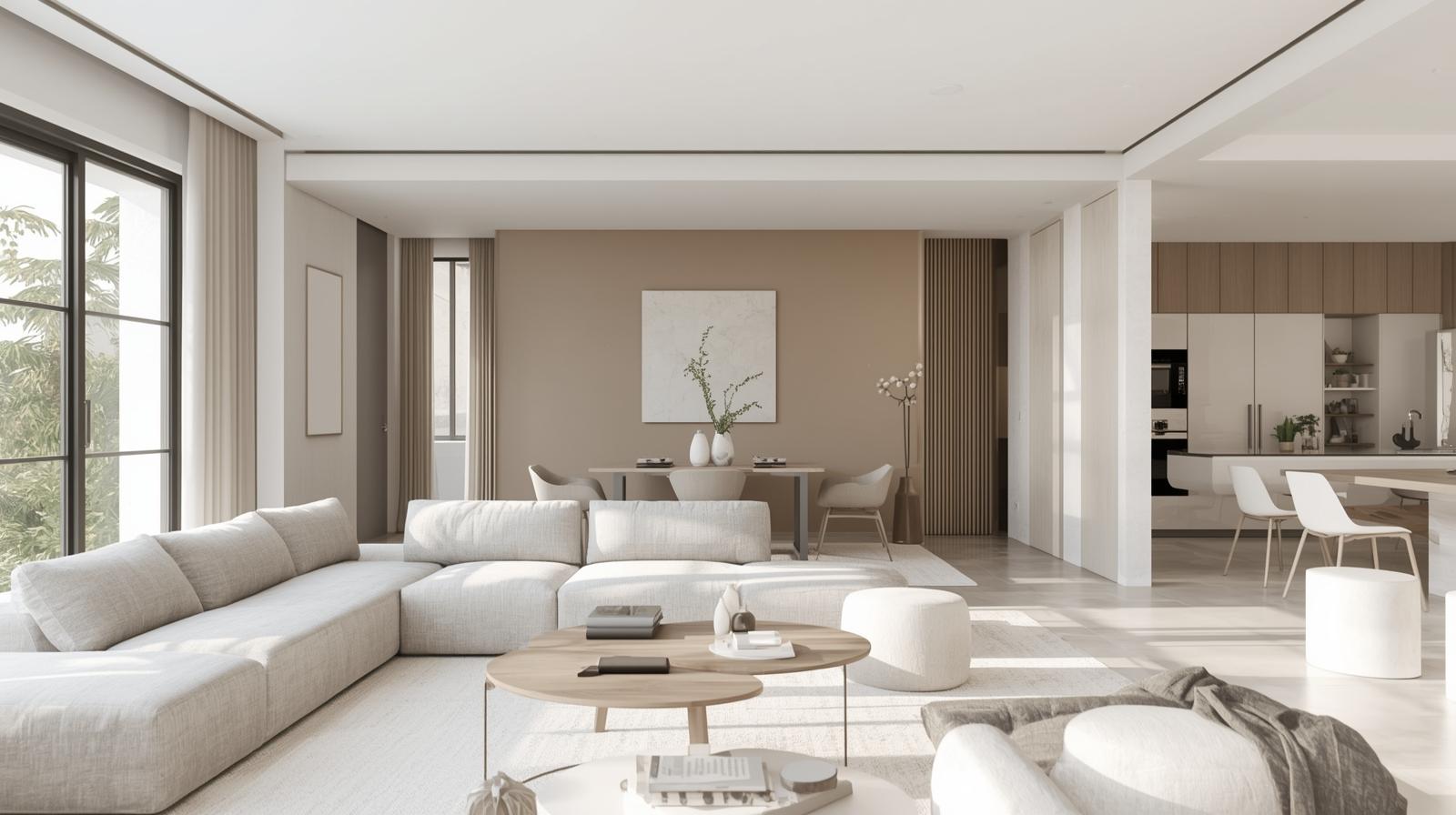
Greige
Greige, the blend of gray and beige, has become a staple of whole-house neutral palettes for its perfect balance of warm and cool. These colors provide the sophistication of gray with the warmth of beige, creating versatile neutrals that work in almost any room.
Benjamin Moore’s Revere Pewter remains one of the most popular greiges for its perfect balance and ability to shift with light throughout the day. Sherwin-Williams’s Agreeable Gray offers another beloved option, slightly warmer and equally versatile.
Greige works beautifully in open-concept homes where spaces need to flow together. It adapts to different lighting conditions and pairs with virtually any accent color.
Warm Gray
Warm grays with brown undertones create sophisticated, cozy spaces that feel both modern and welcoming. These colors provide more depth than white while remaining neutral enough for whole-house application.
Benjamin Moore’s Edgecomb Gray and Sherwin-Williams’s Worldly Gray offer warm gray options with complexity that prevents them from reading as flat. These colors work beautifully in living rooms, bedrooms, and hallways, creating calm backdrops that never feel cold.
Taupe
Taupe, with its complex blend of brown, gray, and sometimes purple undertones, adds richness to whole-house palettes. These colors feel substantial and intentional, providing more character than standard beige while remaining flexible.
Taupe works particularly well in traditional homes and spaces with warm wood tones. It adds depth without drama, creating rooms that feel grounded and sophisticated.
Accessible Beige
Sherwin-Williams’s Accessible Beige has become a favorite for those seeking warmth without the yellow undertones that can make beige feel dated. This color reads as a true warm neutral, working beautifully with both warm and cool accents.
Accessible Beige provides more warmth than greige while maintaining sophistication. It works well in homes with warm flooring and traditional furnishings.
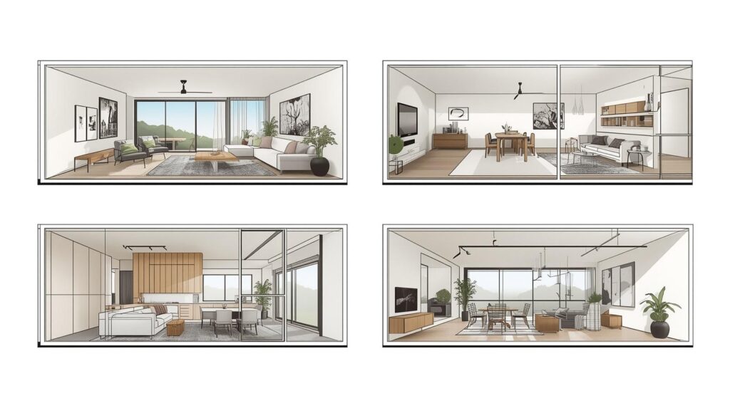
Room-by-Room Considerations
While your whole-house palette provides continuity, each room has unique considerations.
Entryways and Hallways
These transitional spaces set the tone for your home and connect all other rooms. They benefit from colors that work well with everything else in your palette. Your main neutral often works beautifully here, providing consistency from the moment you walk in.
Entryways often have limited natural light, so consider how your chosen color will appear under artificial lighting. Test samples at various times of day before committing.
Living Rooms
Living rooms accommodate various activities and often feature significant furnishings and artwork. Your neutral backdrop should recede, allowing these elements to shine. The main color from your palette typically works well here.
Consider how your living room’s light affects your chosen neutral. South-facing rooms may benefit from slightly cooler options; north-facing rooms may need warmth.
Kitchens
Kitchens have more fixed elements than most rooms. Cabinetry, countertops, and backsplash all have colors that must work with your wall color. Your chosen neutral should complement these elements while providing fresh, clean backdrop.
White and off-white remain popular for kitchens for their clean appearance. Greige and warm gray also work beautifully, particularly with wood cabinets.
Dining Rooms
Dining rooms often host evening gatherings under artificial light. Consider how your neutral will appear under dimmers and candlelight. Warmer neutrals typically perform better in these conditions than cooler options.
Bedrooms
Bedrooms benefit from the calm that neutrals provide. Your whole-house palette works beautifully here, creating serene spaces that promote rest. Consider slightly warmer or softer versions for bedrooms if your main neutral feels too active.
Bathrooms
Bathrooms have moisture considerations and often feature tile and fixtures with their own colors. Your neutral should complement these elements while providing fresh, clean appearance. Lighter neutrals typically work best in bathrooms, where cleanliness is paramount.
Home Offices
Home offices benefit from neutral backdrops that don’t compete for attention. Your whole-house palette provides continuity while allowing you to focus. Consider slightly warmer or cooler versions based on how you work best.
Adding Interest to Neutral Spaces
Neutral does not mean boring. Several strategies add visual interest to neutral spaces.
Texture
Texture becomes essential in neutral schemes. Woven textiles, nubby fabrics, smooth surfaces, and rough materials all add depth that color cannot provide. Layer different textures throughout your spaces for visual richness.
Pattern
Pattern adds interest without color. Textiles with tonal patterns, textured wallcoverings, and graphic elements in neutrals create visual engagement while maintaining calm.
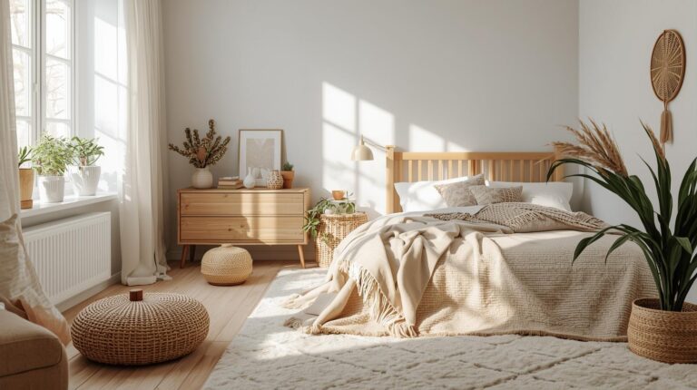
Natural Materials
Wood, stone, leather, and natural fibers add warmth and organic interest to neutral spaces. These materials bring their own subtle colors that complement rather than compete with your palette.
Artwork and Accessories
Your neutral backdrop allows artwork and accessories to shine. Colorful art, vibrant textiles, and collected objects become focal points against calm walls. Change these elements seasonally or as your tastes evolve without repainting.
Architectural Details
Moldings, trim, and architectural features stand out against neutral walls. If your home has interesting architecture, neutrals allow it to take center stage.
Testing Your Whole-House Palette
Before committing to any color, proper testing prevents costly mistakes.
Sample Multiple Rooms
Paint large samples in several rooms throughout your home. Observe how the same color appears in different lighting conditions. A color that works in your living room may read completely differently in your north-facing bedroom.
Observe at Different Times
View your samples at various times of day and under different lighting conditions. Morning light, afternoon sun, and evening artificial light all affect how colors appear. Test under your typical lighting for each room.
Consider Adjacent Spaces
View samples from adjacent rooms to ensure smooth transitions. Colors that work in isolation may clash when seen together. Walk through your home with samples, observing how colors relate from room to room.
Live with Samples
Live with your samples for several days before finalizing. Notice how you feel about the colors at different times, in different moods. The right colors should feel comfortable consistently.
Conclusion: The Beauty of Neutral
Neutral paint colors for whole house applications offer something precious in our busy world: visual calm. When colors flow seamlessly from room to room, when walls recede rather than demand attention, your home becomes a sanctuary. The chaos of daily life finds counterpoint in spaces that feel ordered and intentional.
Yet neutral does not mean empty or boring. Within the framework of a cohesive palette, endless possibilities for expression exist. Texture, pattern, natural materials, artwork, and accessories all add personality while the walls provide consistent foundation.
Whether you choose warm whites, sophisticated greiges, or complex taupes, let your whole-house palette reflect how you want to feel in your home. Calm? Grounded? Fresh? Cozy? The right neutrals support these feelings daily, creating spaces that welcome you home no matter what awaits outside.
Take time with your color decisions. Consider how light moves through your home, how spaces connect, what fixed elements must be honored. Test thoroughly and trust your instincts. The result will be a home that feels connected, calm, and beautifully, effortlessly you.