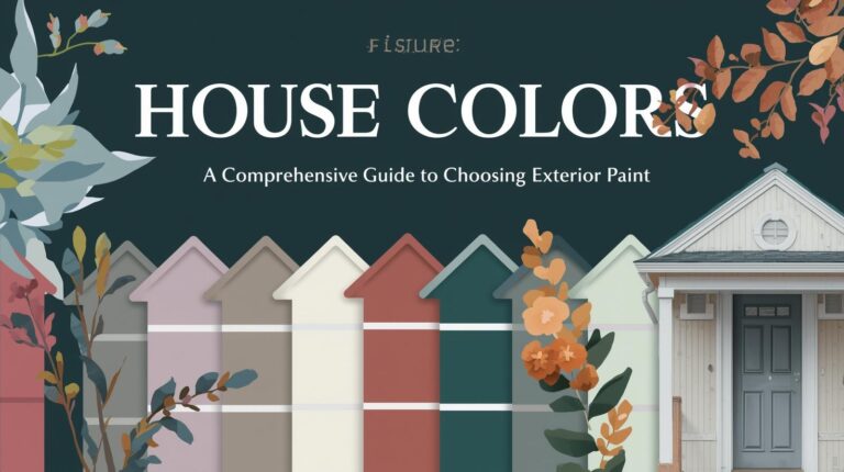
Interior Paint Colors: A Comprehensive Guide to Transforming Your Living Spaces
There is nothing quite as magical as the transformative power of interior paint. With nothing more than a few gallons of color and some careful application, a room can shift from tired to vibrant, from cramped to expansive, from chaotic to calm. Interior paint colors represent one of the most accessible and impactful design tools available to homeowners, offering the ability to completely reshape the character of a space without structural changes or enormous investment. Yet with thousands of colors available, each with its own personality and effects, choosing the right ones can feel overwhelming. This comprehensive guide explores interior paint colors, helping you understand how color works, how to select colors for different rooms, and how to create cohesive, beautiful spaces that truly feel like home.
Understanding How Interior Paint Color Affects Space
Before diving into specific color recommendations, it is essential to understand how paint color fundamentally affects our experience of interior spaces. Color influences perception of size, mood, light, and even temperature.
Light colors make rooms feel larger and more open by reflecting more light. They create the illusion of space, making walls recede and ceilings feel higher. Dark colors do the opposite, making rooms feel more intimate and cozy but potentially smaller. This doesn’t make dark colors wrong; it simply means they should be used intentionally based on your goals for each space.
Color also affects how we perceive light. Cool colors—blues, greens, and purples—tend to recede, making spaces feel more open. Warm colors—reds, oranges, and yellows—advance, making spaces feel more enclosed. A north-facing room with cool light might benefit from warm colors that compensate; a sun-drenched south-facing room might welcome cool colors that balance the warmth.
The psychological effects of color are equally significant. Blues promote calm and relaxation, making them ideal for bedrooms and bathrooms. Yellows energize and uplift, suiting kitchens and home offices. Greens connect us to nature, creating balanced, renewing spaces. Neutrals provide grounding and flexibility, allowing other elements to take center stage.
The Color Wheel and Color Relationships
Understanding basic color theory helps in making informed choices and creating harmonious schemes.
The color wheel organizes colors by their relationships. Primary colors (red, blue, yellow) cannot be created by mixing. Secondary colors (orange, green, purple) result from mixing primaries. Tertiary colors fill the spaces between.
Complementary colors sit opposite each other on the wheel (blue and orange, red and green, yellow and purple). These pairs create vibrant contrast when used together. Analogous colors sit next to each other (blue, blue-green, green) and create harmonious, soothing schemes. Monochromatic schemes use variations of a single color for subtle, sophisticated effects.
Understanding these relationships helps you create intentional color schemes rather than accidental combinations. You don’t need to be a color expert to benefit from this knowledge; even basic awareness guides better choices.
Developing a Whole-Home Color Philosophy
Before selecting specific colors, consider your overall approach to color throughout your home.
Some homeowners prefer cohesive color schemes that flow smoothly from room to room. This approach uses a consistent palette throughout, perhaps varying by room but maintaining relationships. Colors may shift gradually, with adjacent rooms sharing undertones or related hues. Cohesive schemes create flow and harmony, making smaller homes feel larger and more intentional.
Other homeowners enjoy distinct spaces with their own character. A calm blue bedroom, an energetic yellow kitchen, a sophisticated gray living room, each can be exactly what you want without concern for relationships. This approach works well in larger homes where rooms are separated and transitions less noticeable.
Most homes benefit from a middle path—some consistency with room for expression. Perhaps a neutral palette throughout with accent colors varying by room, or cool colors in relaxing spaces and warm colors in active ones. The key is intentionality, knowing why you’re making each choice.
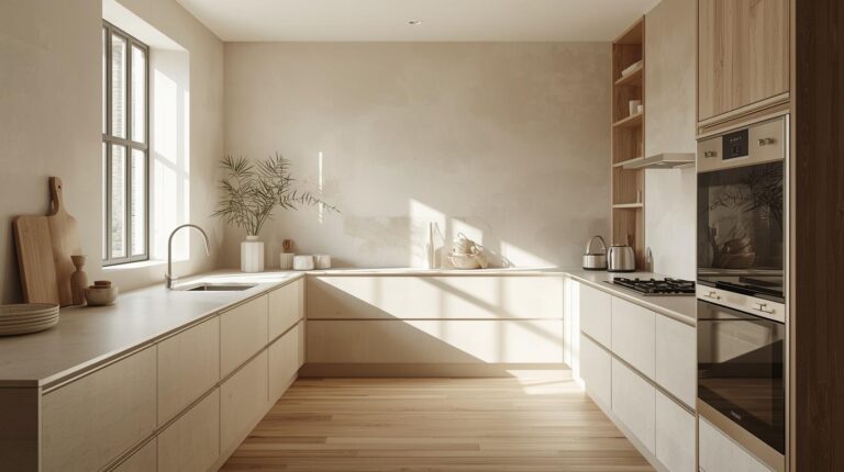
Neutral Interior Paint Colors
Neutrals form the foundation of countless interiors for good reason. They provide flexibility, allowing furniture and accessories to change without repainting. They create calm, uncluttered backdrops that make spaces feel larger. And they work with virtually any design style, from traditional to modern to eclectic.
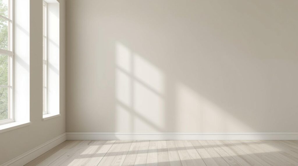
White and Off-White
White remains the most popular interior color for its versatility and light-reflecting properties. White walls make rooms feel larger and brighter, providing a clean canvas for artwork, furniture, and accessories. White also allows architectural details to shine, with moldings and trim gaining definition against white backgrounds.
Not all whites are equal. Pure white can feel stark, particularly in rooms with limited natural light. Warm whites with cream or yellow undertones create cozier atmospheres. Cool whites with gray or blue undertones feel crisp and modern. Popular whites include Benjamin Moore’s Simply White (warm), Sherwin-Williams’s Pure White (balanced), and Farrow & Ball’s Wimborne White (classic).
Off-whites, including ivory, cream, and ecru, add warmth while maintaining lightness. These colors work beautifully in traditional and farmhouse interiors, creating inviting backdrops that feel soft and welcoming.
Gray
Gray has become a staple of contemporary interiors for its sophisticated neutrality. From pale silver to soft charcoal, gray offers endless possibilities for creating calm, refined spaces. Warm grays with brown or beige undertones create cozy atmospheres. Cool grays with blue undertones feel crisp and modern.
Gray works beautifully as a backdrop for colorful furnishings, allowing brighter pieces to pop. It also pairs elegantly with other neutrals, white trim, natural wood tones, and black accents. Popular grays include Benjamin Moore’s Revere Pewter (warm), Sherwin-Williams’s Agreeable Gray (balanced), and Farrow & Ball’s Cornforth White (cool).
The key lies in choosing the right undertone. Gray that reads slightly blue may clash with warm wood floors; gray with purple undertones may feel unexpected against certain furnishings. Test samples near your fixed elements before committing.
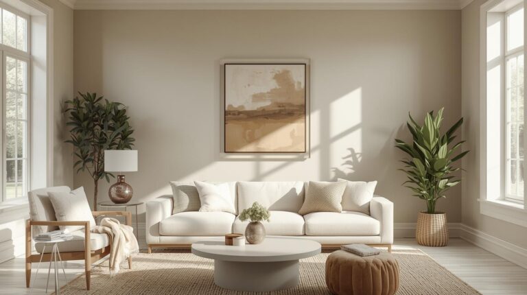
Beige and Greige
Beige, long dismissed as boring, has experienced a renaissance in recent years. Modern beiges have greater depth and complexity than their 1990s predecessors, with undertones that add richness without reading as yellow or pink. These colors create warm, inviting spaces that feel grounded and natural.
Greige, a blend of gray and beige, offers the best of both worlds. These colors have the sophistication of gray with the warmth of beige, creating versatile neutrals that work in almost any space. Greige walls provide calm backdrops that change subtly throughout the day as light shifts.
Taupe
Taupe, with its complex blend of brown, gray, and sometimes purple undertones, adds sophistication to interiors. These colors feel richer than standard beige while remaining neutral enough for flexibility. Taupe works beautifully in traditional spaces, adding depth without drama, and in modern interiors seeking warmth without color.
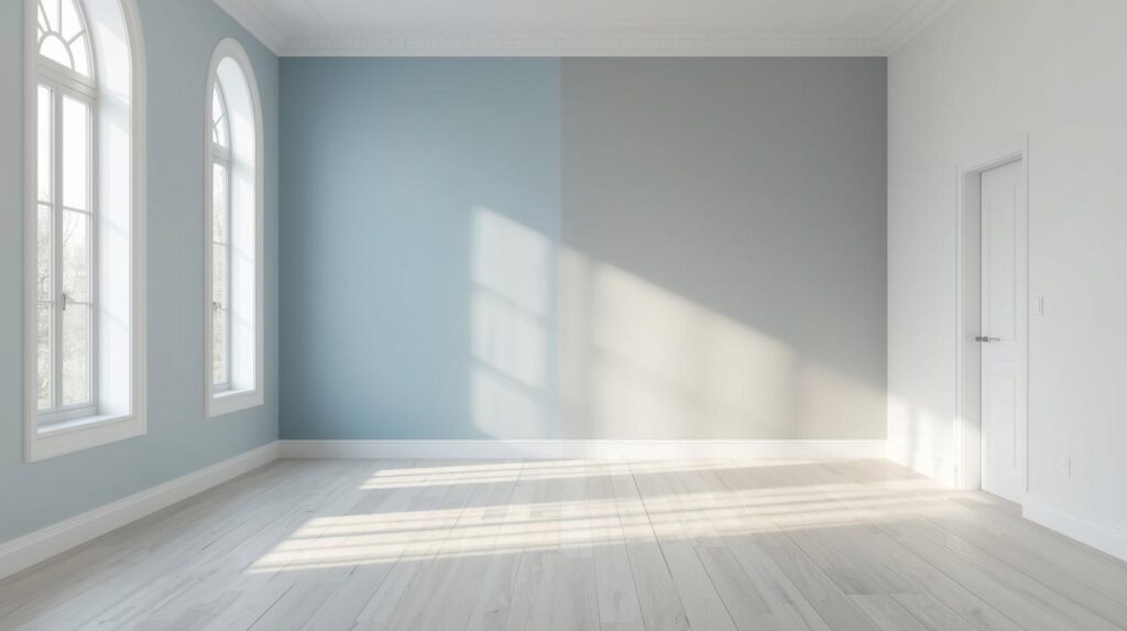
Cool Interior Paint Colors
Cool colors—blues, greens, and purples—create calm, restful spaces ideal for bedrooms, bathrooms, and living areas where relaxation is the priority.
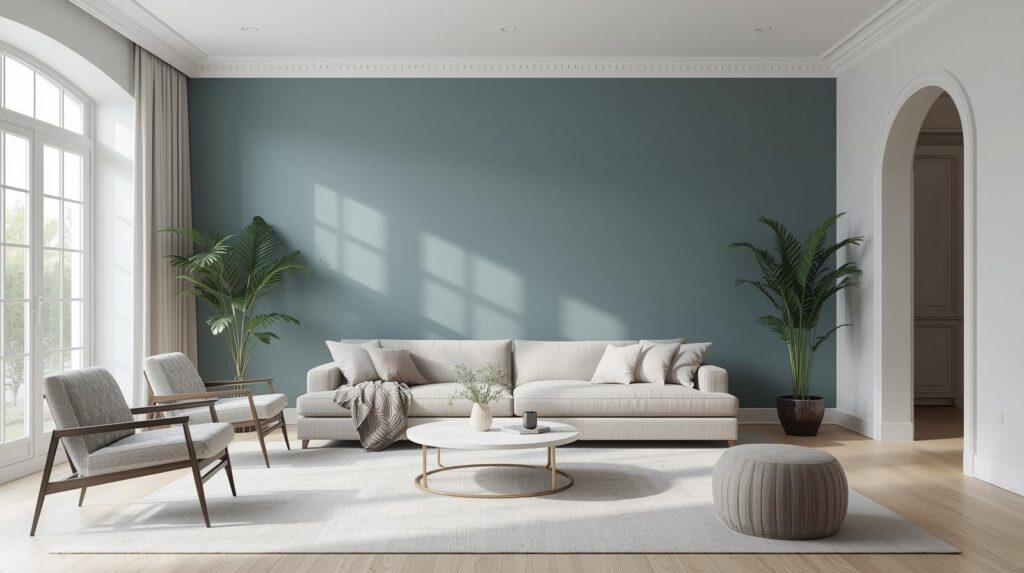
Blue
Blue consistently ranks as the most popular interior color, and for good reason. This versatile hue ranges from pale sky to deep navy, offering options for every style and space. Blue promotes calm and relaxation, making it ideal for bedrooms and bathrooms where unwinding is the goal.
Pale blues create airy, open feelings, making small rooms feel larger. These soft hues work beautifully with white trim and natural wood tones, creating spaces that feel fresh and serene. Popular choices include Benjamin Moore’s Breath of Fresh Air and Sherwin-Williams’s Rainwashed.
Medium blues, like periwinkle or classic colonial blue, add more presence while maintaining calm. These colors work well in living rooms and dining rooms with good natural light. Pair with crisp white trim and touches of yellow or green for balanced compositions.
Deep blues, navy and indigo, create dramatic, enveloping spaces perfect for home offices, libraries, or accent walls. These colors make walls feel closer, creating cozy cocoons that promote focus. Use in larger rooms or on accent walls to avoid overwhelming smaller spaces.
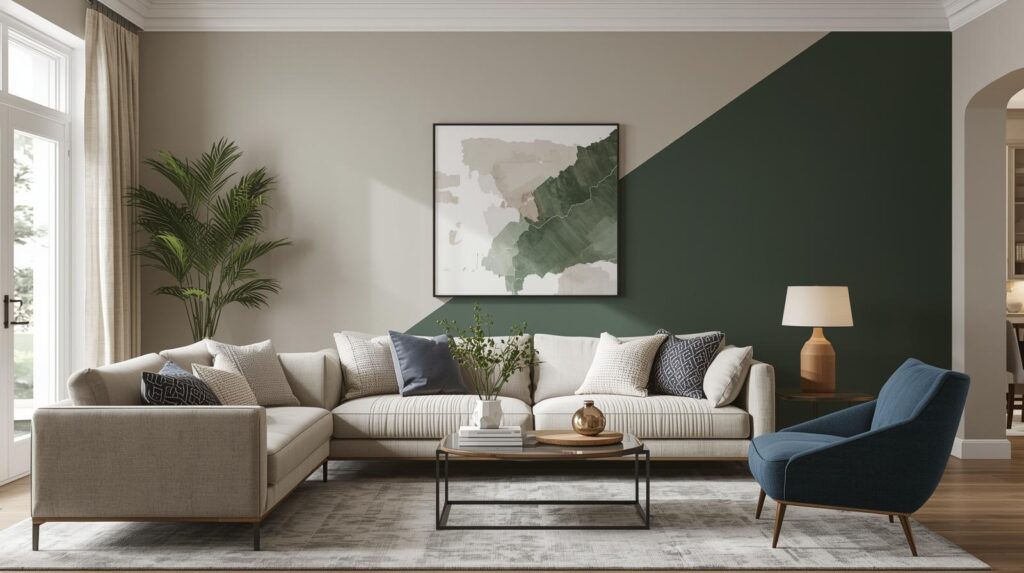
Green
Green connects us to nature, creating feelings of renewal, balance, and calm. From pale sage to deep forest, green offers options for every room and style.
Sage green, with its gray undertones, provides subtle color that feels both natural and sophisticated. These walls work beautifully in bedrooms, living rooms, and home offices, adding color without overwhelming. Pair with white trim, natural wood, and touches of cream for serene compositions.
Olive and moss greens bring more saturation while maintaining connection to nature. These earthy tones work well in kitchens, dining rooms, and spaces with plants, creating cohesive indoor-outdoor connections. Leather, wood, and natural fibers complement these colors beautifully.
Emerald and forest greens make dramatic statements in larger spaces. These deep hues create luxurious, enveloping rooms perfect for dining rooms, libraries, or accent walls. Gold accents and rich woods complement these colors beautifully.
Purple and Lavender
Purple, used thoughtfully, adds unexpected sophistication to interiors. Pale lavender creates soft, romantic spaces that feel fresh and modern. These walls work beautifully in bedrooms and bathrooms, with gray and white trim creating calm, sophisticated rooms that avoid typical purple pitfalls.
Deeper plums and eggplants create dramatic, luxurious spaces perfect for dining rooms or formal living areas. These rich hues envelop rooms in warmth, creating intimate atmospheres ideal for evening entertaining. Gold and brass accents complement these colors beautifully.
Warm Interior Paint Colors
Warm colors—reds, oranges, and yellows—create energetic, welcoming spaces ideal for kitchens, dining rooms, and areas where activity and conversation take priority.
Yellow
Yellow brings sunshine indoors, creating spaces that feel cheerful and welcoming. From pale butter to bold gold, yellow offers options for every room.
Pale yellows, like buttercream or vanilla, add warmth without overwhelming. These soft hues work beautifully in north-facing rooms needing visual warmth, creating cozy atmospheres even on gray days. White trim keeps the look fresh and clean. Popular choices include Benjamin Moore’s Hawthorne Yellow and Sherwin-Williams’s Buttered Yam.
Medium yellows, like honey or marigold, bring more energy while remaining approachable. These colors work well in kitchens, dining rooms, and entryways, where their welcoming character shines. Pair with gray or blue accents for balanced compositions.
Deep golds create dramatic, luxurious spaces perfect for formal dining rooms or accent walls. These rich hues add warmth and sophistication, particularly effective in rooms with evening use. Jewel tones and metallics complement these colors beautifully.
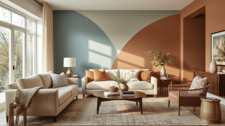
Orange and Terracotta
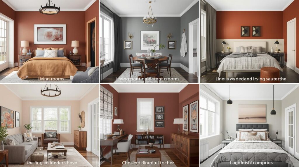
Orange, used thoughtfully, adds warmth and energy to interiors. Terracotta and burnt orange, with their earthy undertones, prove particularly popular for their natural, grounded quality.
Terracotta walls create warm, enveloping spaces that feel connected to the earth. These colors work beautifully in Southwestern, Mediterranean, and bohemian interiors, adding authentic character. Natural materials—wood, stone, and woven textures—complement terracotta perfectly. Popular choices include Farrow & Ball’s Terracotta and Benjamin Moore’s Burnt Orange.
Peach and apricot offer softer orange options with less intensity. These warm, welcoming hues work well in bedrooms and living rooms seeking color without drama. Pair with cream and natural wood for fresh, modern compositions.
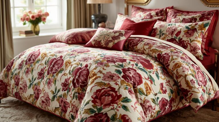
Red
Red, used sparingly, adds drama and energy to interiors. Deep burgundies and wine shades create luxurious, intimate spaces perfect for dining rooms and libraries. These rich hues envelop rooms in warmth, creating dramatic backdrops for traditional furnishings.
Brick reds offer more casual options with earthy undertones. These colors work well in rustic, farmhouse, and industrial spaces, adding warmth without formality. Natural materials and textures complement these colors beautifully.
Use red thoughtfully; as the most intense color, it can overwhelm if overused. Consider accent walls or rooms with abundant natural light where red can show its full character without dominating.
Interior Paint Colors by Room
Different rooms have different functions, and paint colors should support those functions.
Living Room Paint Colors
Living rooms accommodate various activities, from quiet reading to lively entertaining. Colors should be versatile enough for all. Soft neutrals, warm grays, and muted blues and greens provide flexible backdrops that work for any occasion. Consider your living room’s light and size when choosing.
Dining Room Paint Colors
Dining rooms benefit from colors that enhance the dining experience. Warm colors stimulate appetite and conversation, making terracotta, warm reds, and rich golds popular choices. Deeper colors create intimate atmospheres perfect for evening entertaining. Consider how colors will look under candlelight.
Kitchen Paint Colors
Kitchens benefit from clean, fresh colors that feel hygienic and welcoming. Whites, creams, soft grays, and pale blues and greens prove popular. These colors reflect light well, important in work areas, and provide neutral backdrops for cabinets and countertops that may change over time.
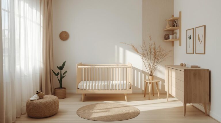
Bedroom Paint Colors
Bedrooms should promote rest and relaxation. Soft, muted colors work best—blues, greens, lavenders, and warm neutrals. Avoid stimulating bright colors that may interfere with sleep. Consider how colors look in morning and evening light, as both matter in bedrooms.
Bathroom Paint Colors
Bathrooms benefit from fresh, clean colors that feel hygienic and spa-like. Soft blues, greens, and grays prove popular, as do crisp whites. Consider moisture levels; bathrooms need paints with appropriate sheen and mildew resistance.
Home Office Paint Colors
Home offices should support focus and productivity. Blues promote calm concentration, greens provide balance, and yellows add energy for creative work. Consider your work style and choose accordingly.
Hallways and Entryways
These transitional spaces set the tone for your home and connect rooms. Lighter colors keep them feeling open; slightly darker colors can make them feel like destinations. Consider how colors transition from one room to another.
Paint Finishes and Their Importance
Beyond color, paint finish affects both appearance and durability.
Flat and matte finishes hide imperfections well but clean less easily. They work best in low-traffic areas like adult bedrooms and formal living rooms where washability matters less.
Eggshell and satin finishes offer slight sheen with better cleanability. These versatile finishes work well in most living spaces, including family rooms, hallways, and children’s rooms where some washability is needed.
Semi-gloss and gloss finishes provide durability and easy cleaning. They work best on trim, doors, cabinets, and in high-moisture areas like kitchens and bathrooms where washability matters most.
Testing and Committing
Before committing to a color, proper testing prevents costly mistakes.
Paint large samples directly on your walls, at least 12-inch squares, and observe at different times of day. Colors look different in morning, midday, and evening light. Artificial lighting also affects appearance; observe under your typical evening lighting as well.
Consider undertones carefully. Every color has undertones that become apparent next to other colors. A gray may read slightly blue next to warm wood, slightly green next to certain fabrics. Test your color near fixed elements that will remain—flooring, countertops, large furniture pieces.
Live with your samples for several days before deciding. Notice how you feel about the color at different times, in different moods. The right color should feel comfortable consistently, not just look good in photographs.
Current Trends in Interior Paint Colors
While timeless colors always work, understanding current trends helps you make informed choices.
Biophilic colors—greens, earthy tones, and nature-inspired hues—remain popular as homeowners seek connection to nature. Warm neutrals have returned after years of cool grays dominating. Bold accent walls and color-drenched rooms (where ceiling and trim match walls) have gained traction. Dark, moody colors for libraries, dining rooms, and even bedrooms continue to appeal.
Remember that trends come and go. Choose colors you genuinely love, not just colors that are currently popular. Your home should please you for years, not just for this season.
Conclusion: The Power of Interior Paint
Interior paint colors profoundly affect how you experience your living spaces. The right colors support relaxation, encourage productivity, and create backdrops that enhance everything else in your rooms. The wrong colors, however beautiful in isolation, can feel uncomfortable and wrong.
Take time with your color selections. Consider how you use each room, what feeling you want to create, how light affects the space. Test samples thoroughly and live with them before committing. Trust your instincts; the colors that feel right to you are likely the right choices, regardless of trends or others’ opinions.
Whether you choose serene blues, warm terracotta, sophisticated grays, or crisp whites, your interior paint colors set the stage for life lived within your walls. Choose thoughtfully, and you’ll create spaces that welcome you home for years to come.