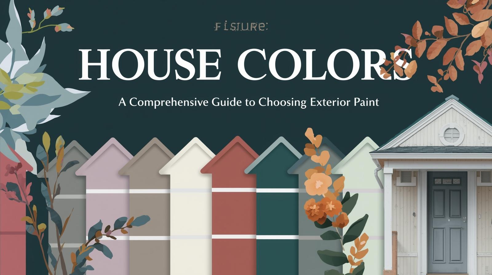
House Colors: A Comprehensive Guide to Choosing Exterior Paint
There is nothing quite as transformative as a fresh coat of paint on a house. In a matter of days, with skilled application and thoughtful color selection, a home can be completely reborn, its character enhanced, its flaws minimized, its curb appeal maximized. The colors you choose for your house exterior make a statement about you and your home, affecting not only your own enjoyment but also your property’s value and your neighbors’ experience of the street. From classic white farmhouses to bold Victorian palettes, from earthy craftsman tones to crisp modern monochromes, the options can seem overwhelming. Yet understanding a few key principles can guide you toward choices that will please you for years to come. This comprehensive guide explores house colors, helping you navigate the process of selecting exterior paint with confidence and style.
The Importance of Exterior Color
Before diving into specific color recommendations, it is worth understanding why exterior color matters so significantly. Unlike interior colors, which affect only those inside your home, exterior colors contribute to the public realm, shaping your neighborhood’s character and your home’s relationship to its surroundings.
Exterior color affects first impressions profoundly. Potential buyers, visitors, and even passersby form opinions based on what they see from the street. A well-chosen color scheme enhances architectural features, creates curb appeal, and suggests a well-maintained home. Poor color choices can detract from even the finest architecture and suggest neglect or poor taste.
Exterior color also affects how you feel about your home. Coming home to colors you love provides daily satisfaction. The right colors make you proud to welcome guests and happy to return after time away. They express your personality and style to the world.
Factors to Consider Before Choosing Colors
Several important factors should guide your color selection before you ever open a paint deck.
Architectural Style
Your home’s architectural style should strongly influence color choices. Different styles have traditional color palettes that suit their character. A Victorian house calls for different colors than a mid-century modern. A Craftsman bungalow has its own traditional palette. Respecting these conventions doesn’t mean you must choose historically accurate colors, but understanding them provides a foundation for informed decisions.
Traditional Colonial homes often look best in classic colors, white, cream, soft yellow, with darker shutters and doors. Victorian homes can handle more adventurous palettes with multiple colors highlighting architectural details. Craftsman bungalows typically use earthy colors drawn from nature, greens, browns, and warm grays. Mid-century modern homes suit both period-appropriate palettes and bold contemporary choices.
Neighborhood Context
Consider your home in relation to its surroundings. A color that looks wonderful in isolation might clash with neighboring houses or feel out of place in your community. While you need not match your neighbors exactly, some sensitivity to context prevents your home from looking like an uncomfortable outlier.
Look at other houses on your street. What colors predominate? Are there patterns or traditions that give your neighborhood character? A cohesive streetscape enhances property values for everyone. This doesn’t mean all houses should look alike, but colors that relate harmoniously to neighbors create a more pleasant environment for all.
Fixed Elements
Certain exterior elements cannot easily change and must be considered in your color scheme. Roof color is perhaps the most significant fixed element. A red roof limits options differently than a gray or black roof. Stone or brick veneers have colors that must be harmonized with paint choices. Driveway materials, walkways, and existing landscaping all affect how colors will appear.
Work with these fixed elements rather than against them. Choose paint colors that complement your roof, stone, and brick. Test samples near these materials to ensure harmonious relationships.
Climate and Light
Geography affects how colors appear. Intense southern sunlight washes out colors, making pale shades appear even lighter and deep shades appear more saturated. Northern light is cooler and softer, affecting how colors read. Consider your region and your home’s orientation when selecting colors.
In sunny climates, consider how colors will look in bright light all year. Very dark colors absorb heat, potentially increasing cooling costs and stressing siding materials. Very light colors reflect heat but may show dirt more readily. Regional considerations matter.
Classic House Color Categories
House colors generally fall into several categories, each with its own character and appropriate applications.
White and Off-White
White remains the most popular house color for good reason. Clean, classic, and versatile, white suits virtually any architectural style and provides a fresh backdrop for landscaping. White houses feel timeless, appearing appropriate in both historic districts and modern developments.
Pure white can feel stark, particularly in settings with intense sunlight. Off-whites with cream, gray, or beige undertones add warmth while maintaining the fresh quality that makes white so appealing. Benjamin Moore’s White Dove, Sherwin-Williams’s Alabaster, and similar warm whites have become favorites for their versatility.
White works beautifully with any trim color. Dark green or black shutters provide classic contrast. Natural wood doors add warmth. Brick or stone foundations ground the composition. White’s versatility makes it a safe choice that rarely disappoints.
Gray
Gray has emerged as a leading house color in recent decades, offering sophisticated neutrality that suits contemporary and traditional homes alike. From pale silver to deep charcoal, gray provides endless possibilities for creating elegant exteriors.
Light grays read as fresh and modern, particularly effective on contemporary homes with clean lines. Medium grays offer versatility, working with both white and darker trim. Dark grays create dramatic, sophisticated statements, especially effective on larger homes or those with abundant natural light.
Gray pairs beautifully with white trim for crisp, classic looks. Black accents add drama and sophistication. Natural wood elements warm gray’s coolness. The key lies in choosing grays with appropriate undertones; grays that read slightly blue, green, or purple may clash with other elements.
Beige and Tan
Beige and tan, long dismissed as boring, have regained respectability as part of the modern farmhouse and natural palettes. These warm neutrals create welcoming exteriors that feel grounded and approachable.
Light beiges and tans work well in traditional neighborhoods, providing warm alternatives to white. Medium tans suit craftsman and ranch styles particularly well, harmonizing with natural materials. Dark tans and browns create substantial, grounded appearances suitable for larger homes.
These colors pair beautifully with white or cream trim for fresh, classic looks. Darker trim, deep browns or forest greens, adds traditional character. Natural wood elements complement the earthy warmth of these palettes.
Blue
Blue has become increasingly popular for house exteriors, offering color that remains calm and approachable. From pale sky blue to deep navy, blue exteriors make distinctive statements while maintaining broad appeal.
Pale blues create soft, welcoming exteriors that feel fresh and airy. These colors work particularly well on cottage, farmhouse, and coastal styles, evoking sky and water. Crisp white trim completes the classic look.
Medium blues, like classic colonial blue, add more presence while remaining traditional. These colors suit a wide range of architectural styles, from colonial to Victorian to contemporary. White or cream trim provides classic contrast.
Deep navy creates dramatic, sophisticated exteriors that feel substantial and intentional. These dark blues work best on larger homes with abundant natural light and white trim for contrast. The effect is bold but classic, distinctive without being overwhelming.
Green
Green connects houses to their natural surroundings, creating harmonious relationships with landscaping. From soft sage to deep forest, green offers options for every style.
Sage and olive greens, with their gray undertones, create subtle, sophisticated exteriors that blend beautifully with natural settings. These colors suit craftsman, cottage, and farmhouse styles particularly well. Cream or brown trim complements the earthy character.
Forest and hunter greens make bolder statements while maintaining connection to nature. These deep greens work well on larger homes and those with traditional architecture. White trim provides crisp contrast; natural wood adds warmth.
Yellow
Yellow brings sunshine to house exteriors, creating cheerful, welcoming homes that stand out memorably. From pale butter to rich gold, yellow offers options for those seeking distinctive color.
Pale yellows, like cream and butter, provide warm alternatives to white without overwhelming. These soft hues suit cottage, farmhouse, and colonial styles beautifully, adding warmth while maintaining restraint. White trim keeps the look fresh and clean.
Medium yellows, like honey or maize, create cheerful exteriors that command attention positively. These colors work well on Victorian and other ornate styles where historical precedent supports brighter palettes. White or cream trim provides necessary contrast.
Deep golds create rich, substantial exteriors suitable for larger homes and those seeking dramatic presence. These colors work best with abundant natural light and careful trim selection to avoid heaviness.
Red and Burgundy
Red houses make bold statements that never go unnoticed. From classic barn red to deep burgundy, these colors suit specific styles and settings.
Barn red, with its earthy undertones, suits rural and farmhouse settings beautifully. This classic color feels grounded and authentic, connecting houses to agricultural traditions. White trim provides classic contrast.
Burgundy and deep wine shades create sophisticated, dramatic exteriors suitable for Victorian and other ornate styles. These rich colors highlight architectural details while making powerful statements. Cream or gold trim complements the richness.
Earth Tones
Earth tones, drawing from soil, clay, and stone, create grounded, natural exteriors that harmonize with their surroundings. Terracotta, adobe, and brown tones suit Southwestern, Mediterranean, and rustic styles particularly well.
Terracotta and adobe colors create warm, authentic exteriors that feel connected to the earth. These colors work beautifully with natural materials, stone and wood, and suit settings with similar natural palettes.
Browns ranging from light tan to deep chocolate create substantial, grounded exteriors appropriate for many styles. These colors read as natural and timeless, aging gracefully and harmonizing with landscaping.

Trim and Accent Colors
Beyond the main body color, trim and accent colors complete the exterior composition, highlighting architectural details and adding visual interest.
Trim Colors
Trim typically uses lighter or darker colors than the body to define edges and architectural features. White remains the most popular trim color for its crisp definition and versatility. Cream and off-white provide warmer alternatives. For dramatic effect, dark trim, black or dark brown, creates strong contrast that emphasizes form.
Traditional guidelines suggest trim one shade lighter or darker than body color for subtle definition, or contrasting colors for dramatic emphasis. Consider your home’s architecture when deciding. Ornate Victorian homes can handle more contrast; simple modern homes may benefit from subtlety.
Door Colors
The front door deserves special attention as both functional element and focal point. A contrasting door color adds personality and welcomes guests. Classic choices include red for welcoming energy, black for sophistication, blue for calm, or yellow for cheer.
Consider your overall color scheme when choosing door color. The door should relate harmoniously to body and trim colors while standing out as a feature. Sample door colors near your actual door before committing; the right choice will make you smile every time you come home.
Shutter and Accent Colors
Shutters, if present, offer additional opportunities for color expression. Classic choices include black, dark green, or dark blue for traditional looks. More adventurous colors can add personality but risk dating your home.
Other accents, window boxes, railings, and architectural details, can carry accent colors that tie the composition together. Use these elements to repeat colors from your palette, creating cohesive, intentional designs.

Testing and Committing
Before committing to exterior colors, proper testing prevents costly mistakes.
Large Samples
Paint large samples directly on your house, at least 2×2 feet, and observe at different times of day. Colors look different in morning, midday, and evening light. Observe on sunny and cloudy days. Consider how colors appear from the street, from the driveway, from approaches to your home.
Consider Fixed Elements
View samples near your roof, stone, brick, and landscaping. Colors that look beautiful in isolation may clash with fixed elements. Test relationships thoroughly before committing.
Neighborhood Context
Step across the street and view your samples from there. Consider how your choices relate to neighboring houses. A color that excites you up close may feel different in context.
Live with Samples
Live with your samples for several days before finalizing. Notice how you feel about them at different times, in different moods. The right colors should feel comfortable consistently, not just look good in photographs.
Professional Consultation
Given the investment exterior painting represents, professional color consultation often proves worthwhile. Color consultants bring experience, training, and objective perspective to your project. They can identify colors you might not have considered and help you avoid costly mistakes.
Many paint manufacturers offer color consultation services, either in-store or through independent consultants. The relatively modest investment often pays for itself in confidence and satisfaction.
Conclusion: The Joy of Color
Choosing house colors is both responsibility and opportunity. Your choices affect not only your own enjoyment but your home’s place in its community. Yet within that responsibility lies enormous opportunity for expression, for creating a home that reflects your personality and welcomes you daily.
Whether you choose classic white, sophisticated gray, cheerful yellow, or dramatic navy, thoughtful color selection rewards you daily. The right colors make you proud to come home, happy to welcome guests, and satisfied with your place in your neighborhood.
Take time with your color decisions. Consider your home’s architecture, its setting, its fixed elements. Test thoroughly and live with samples. Trust your instincts while respecting context. And when you finally see your home in its new colors, take satisfaction in a job thoughtfully done, a house renewed, a place you’re happy to call home.