Color Schemes for the Home: A Complete Guide to Harmonious Living Spaces
There is something magical about walking into a home where the colors just work. Every room flows naturally into the next, each hue complements its neighbors, and the overall effect is one of harmony, intention, and beauty. Creating such a space does not happen by accident. It requires understanding how colors interact, how they affect mood and perception, and how to build cohesive schemes that express your personality while creating visual peace. Whether you are decorating a new home or refreshing your current space, understanding color schemes transforms how you approach every design decision. This comprehensive guide explores color schemes for the home, helping you create spaces that are beautiful, functional, and uniquely yours.
Understanding Color Theory Basics
Before diving into specific color schemes, it is helpful to understand the fundamental principles of color theory. These concepts provide the foundation for all successful color combinations.
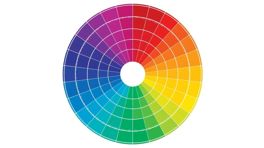
The Color Wheel
The color wheel organizes colors by their relationships. Primary colors—red, blue, and yellow—cannot be created by mixing other colors. Secondary colors—orange, green, and purple—result from mixing two primary colors. Tertiary colors fill the spaces between, created by mixing a primary with a neighboring secondary.
Understanding the color wheel helps you predict how colors will interact. Colors opposite each other create vibrant contrast. Colors next to each other create harmonious blends. This basic knowledge informs every color decision.
Color Temperature
Colors are described as warm or cool. Warm colors—reds, oranges, and yellows—advance visually, making spaces feel cozier and more intimate. They evoke energy, passion, and comfort. Cool colors—blues, greens, and purples—recede, making spaces feel larger and more open. They promote calm, relaxation, and tranquility.
Understanding temperature helps you achieve specific effects. A north-facing room with cool light might benefit from warm colors that compensate. A sun-drenched south-facing room might welcome cool colors that balance the warmth.
Color Value
Value refers to how light or dark a color appears. Light colors reflect more light, making spaces feel larger and brighter. Dark colors absorb light, creating intimacy and drama. Successful color schemes often incorporate a range of values, from light to dark, creating depth and visual interest.
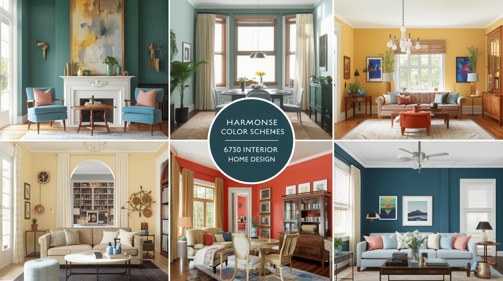
Types of Color Schemes
Several classic color scheme types provide reliable starting points for any room.
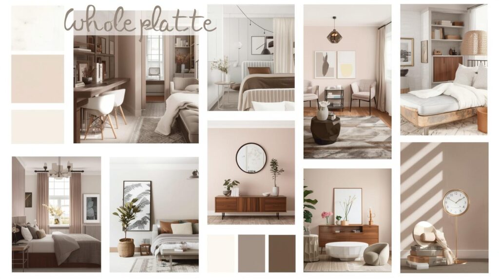
Monochromatic Color Schemes
Monochromatic schemes use variations of a single color, ranging from light to dark and including various tints, tones, and shades. These schemes create sophisticated, calming spaces that feel cohesive and intentional.
A monochromatic blue bedroom might feature pale sky walls, medium blue bedding, and deep navy accents. The variety of values keeps the space interesting while the single hue maintains harmony. Textures become particularly important in monochromatic schemes, providing visual interest that color alone cannot supply.
Monochromatic schemes work well in bedrooms and bathrooms where calm is the goal. They also suit minimalist aesthetics where subtlety matters more than contrast. The key lies in incorporating enough value range to prevent the space from feeling flat.
Analogous Color Schemes
Analogous schemes use colors that sit next to each other on the color wheel. These combinations create harmonious, soothing spaces with subtle visual interest. Common analogous combinations include blue-green-blue, red-orange-yellow, and yellow-green-blue.
An analogous living room might feature sage green walls, blue-green accent pillows, and soft blue accessories. The colors blend seamlessly, creating a space that feels natural and peaceful. Analogous schemes work beautifully in rooms where relaxation is the priority.
The key to successful analogous schemes lies in choosing one dominant color and using others as accents. Without this hierarchy, the scheme can feel muddy or unbalanced. Let one color lead while others support.
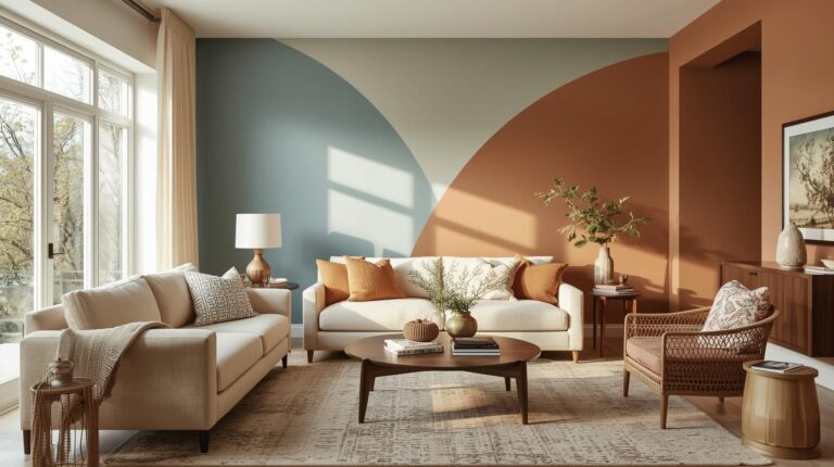
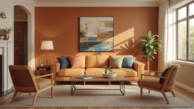
Complementary Color Schemes
Complementary schemes use colors opposite each other on the color wheel. These combinations create vibrant contrast and visual energy. Classic complementary pairs include blue and orange, red and green, and yellow and purple.
A complementary kitchen might feature navy cabinets with warm brass fixtures and touches of terracotta. The contrast creates excitement and draws the eye. Complementary schemes work well in spaces where energy is desired, kitchens, dining rooms, and playrooms.
The intensity of complementary schemes can overwhelm if not balanced. Using one color as dominant and the other as accent usually works better than equal intensity. Neutrals help ground these vibrant combinations.
Split-Complementary Color Schemes
Split-complementary schemes offer the contrast of complementary colors with more subtlety. Instead of using the direct opposite, you use the two colors adjacent to the opposite. For example, with blue, you might use yellow-orange and red-orange rather than straight orange.
These schemes provide visual interest and contrast without the intensity of true complements. They work well in living rooms and family rooms where you want energy without overwhelm. The additional color also creates more complex, sophisticated palettes.
Triadic Color Schemes
Triadic schemes use three colors equally spaced on the color wheel. Common triadic combinations include red, yellow, and blue or orange, green, and purple. These schemes create vibrant, balanced spaces full of energy and personality.
Triadic schemes require careful handling to avoid chaos. Choosing one dominant color and using the others as accents typically works best. Neutral backgrounds help ground the intensity. These schemes suit creative spaces, children’s rooms, and anywhere personality should shine.
Tetradic and Square Color Schemes
Tetradic schemes use four colors arranged in two complementary pairs. Square schemes use four colors equally spaced on the wheel. These complex schemes offer rich possibilities but require sophisticated handling.
Professional designers often use these schemes, but homeowners can succeed by keeping most colors muted and using the full intensity sparingly. These schemes work best in larger spaces where the complexity can breathe.
Building a Whole-Home Color Palette
Beyond individual rooms, considering how colors flow throughout your home creates cohesive, intentional spaces.
The Flow Principle
Colors should transition smoothly from room to room, creating a sense of flow rather than jarring shifts. This does not mean every room must be the same color, but adjacent rooms should relate through shared undertones or complementary relationships.
A common approach uses a neutral palette throughout with accent colors changing by room. The neutrals provide continuity while accents express each space’s personality. Another approach shifts colors gradually, analogous transitions that feel natural rather than abrupt.
Public vs. Private Spaces
Consider the different functions of public and private spaces. Public areas like living rooms, dining rooms, and entryways might use more sophisticated, welcoming colors. Private spaces like bedrooms and bathrooms can embrace more personal, restorative hues.
This distinction helps create appropriate atmospheres while maintaining overall cohesion. A vibrant dining room might transition to a calming hallway, then to a serene bedroom. The journey through your home becomes an experience rather than a series of disconnected spaces.
Fixed Elements
Your color scheme must work with fixed elements that cannot easily change. Flooring, countertops, cabinetry, and tile all have colors that will remain. Choose wall colors that complement these permanent features rather than fighting them.
Test paint samples near your fixed elements before committing. A beautiful color that clashes with your oak floors will never feel right, regardless of how lovely it looks on the chip.
Room-by-Room Color Considerations
Different rooms invite different color approaches based on function, light, and mood.
Entryway and Foyer Colors
Entryways set the tone for your entire home. They should feel welcoming and give visitors a preview of your style. Warm neutrals, soft greens, and inviting blues all work well. Consider how the entry color transitions to adjacent rooms.
Entryways often have limited natural light, so consider how colors will appear under artificial lighting. Test samples at various times of day before committing.
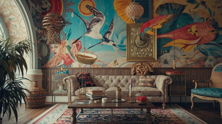
Living Room Colors
Living rooms accommodate various activities from quiet reading to lively entertaining. Versatile colors that adapt to different moods work best. Warm greiges, dusty blues, and sage greens provide flexible backdrops that work for any occasion.
Consider your living room’s light and size when choosing. Small rooms benefit from lighter colors; large rooms can handle deeper hues. North-facing rooms may need warm colors; south-facing rooms can handle cooler palettes.
Dining Room Colors
Dining rooms benefit from colors that enhance the dining experience. Warm colors stimulate appetite and conversation, making terracotta, warm reds, and rich golds popular choices. Deeper colors create intimate atmospheres perfect for evening entertaining.
Consider how colors will look under candlelight, as dining rooms often host evening gatherings. Test samples under your typical evening lighting to ensure they perform as desired.
Kitchen Colors
Kitchens benefit from clean, fresh colors that feel hygienic and welcoming. Whites, creams, soft grays, and pale blues and greens prove popular. These colors reflect light well, important in work areas, and provide neutral backdrops for cabinets and countertops that may change over time.
Cabinetry colors deserve special attention as they dominate kitchen spaces. Sage green, navy, and charcoal have become popular alternatives to white, adding personality while maintaining sophistication.
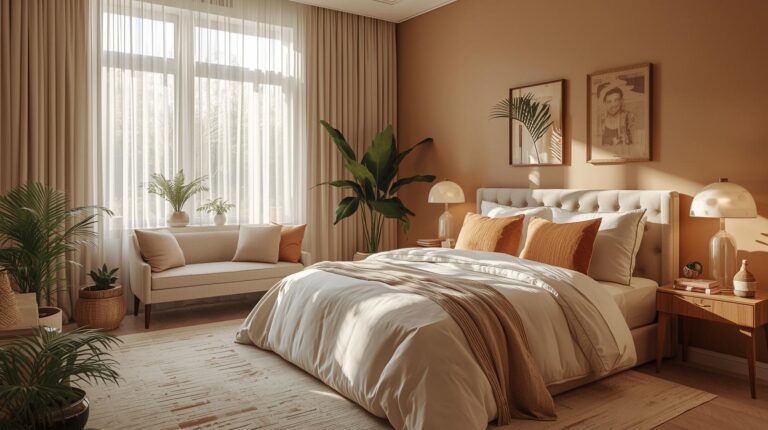
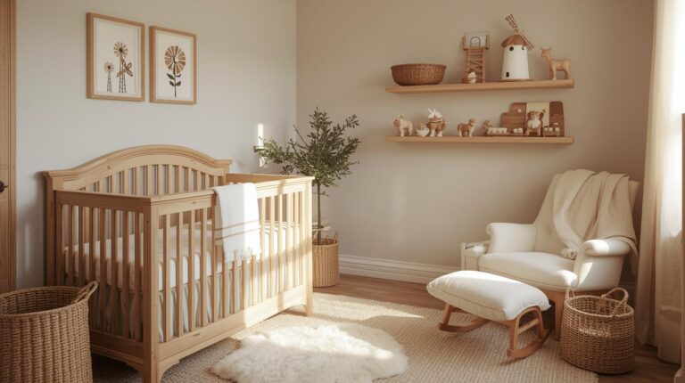
Bedroom Colors
Bedrooms should promote rest and relaxation. Soft, muted colors work best, blues, greens, lavenders, and warm neutrals. Avoid stimulating bright colors that may interfere with sleep. Consider how colors look in morning and evening light, as both matter in bedrooms.
Darker colors can create cozy, enveloping bedrooms for those who sleep deeply and have good natural light during waking hours. Charcoal and navy bedrooms feel luxurious and intimate when balanced with soft textures and warm lighting.
Bathroom Colors
Bathrooms benefit from fresh, clean colors that feel hygienic and spa-like. Soft blues, greens, and grays prove popular, as do crisp whites. These colors associate with water and cleanliness while promoting relaxation.
Consider moisture levels when choosing bathroom colors. Glossier finishes resist moisture better than flat paints. Ensure adequate ventilation to prevent issues regardless of color choice.
Home Office Colors
Home offices should support focus and productivity. Blues promote calm concentration, making them ideal for analytical work. Greens provide balance and renewal, supporting creative thinking. Yellows add energy but may prove distracting for detailed tasks.
Consider how you work when choosing office colors. Different tasks benefit from different color environments. If your work varies, neutral backdrops with colorful accents offer flexibility.
Using Accent Colors Effectively
Accent colors add personality and visual interest to neutral schemes.
The 60-30-10 Rule
A classic design principle suggests using 60 percent dominant color, 30 percent secondary color, and 10 percent accent color. This比例 creates balanced, intentional schemes where accents pop without overwhelming.
Your dominant color typically covers walls and large furniture. The secondary color appears on upholstery, curtains, and larger accessories. The accent color provides punches of interest through pillows, art, and smaller decorative objects.
Accent Walls
A single wall in a contrasting color creates focal points without committing to an entire room of bold color. The wall behind a bed, the wall with a fireplace, or the wall opposite the entry often work best for accent treatment.
Choose accent colors that relate to your overall palette, perhaps a deeper version of your main color or a complementary hue. The accent should feel intentional, not random.
Color Through Accessories
For those hesitant to commit to wall color, accessories offer flexibility. Pillows, throws, art, and decorative objects introduce color without permanence. This approach allows seasonal changes and evolution over time.
Testing and Committing
Before finalizing any color scheme, proper testing prevents costly mistakes.
Sample Painting
Paint large samples directly on your walls, at least 12-inch squares, and observe at different times of day. Colors look different in morning, midday, and evening light. Artificial lighting also affects appearance; observe under your typical evening lighting as well.
Consider Undertones
Every color has undertones that become apparent next to other colors. A gray may read slightly blue next to warm wood, slightly green next to certain fabrics. Test your color near fixed elements that will remain flooring, countertops, large furniture pieces.
Live with Samples
Live with your samples for several days before deciding. Notice how you feel about the colors at different times, in different moods. The right colors should feel comfortable consistently, not just look good in photographs.
Conclusion: The Art of Color
Color schemes for the home represent both science and art. Understanding color theory provides the foundation, but your personal response to color matters most. The schemes that feel right to you, that make you happy every time you walk through the door, are always the right choices.
Whether you prefer monochromatic calm, analogous harmony, or complementary energy, let your color choices reflect your personality and support how you actually live. A beautiful color scheme that does not work for your life is not beautiful at all. The best schemes are those that serve you daily.
Take time with your color decisions. Consider how each room functions, how light affects the space, how colors transition throughout your home. Test thoroughly and trust your instincts. The result will be a home filled with colors that work together, that support your life, that feel like you.
Color transforms houses into homes. Choose wisely, and your spaces will welcome you for years to come.