Color Combinations for Home: Creating Beautiful and Harmonious Spaces
There is something deeply satisfying about walking into a room where the colors work together perfectly. The walls, furniture, textiles, and accessories all relate to one another in ways that feel intentional, balanced, and beautiful. Achieving this effect is not about luck or instinct alone. It comes from understanding how colors interact and knowing which combinations create specific moods and effects. Whether you are decorating a new home or refreshing your current space, understanding color combinations transforms how you approach every design decision. This comprehensive guide explores color combinations for the home, helping you create spaces that are visually harmonious, emotionally supportive, and uniquely yours.
The Foundation of Great Color Combinations
Before exploring specific color pairings, it is helpful to understand the principles that make any combination successful.
Balance and Proportion
Great color combinations are not about equal amounts of each hue. The most successful schemes use one dominant color, a secondary color, and an accent color. This hierarchy creates visual interest while maintaining harmony. The classic 60-30-10 rule suggests using 60 percent dominant color, 30 percent secondary color, and 10 percent accent color.
Your dominant color typically covers walls and large furniture pieces. The secondary color appears on upholstery, curtains, and larger accessories. The accent color provides punches of interest through pillows, art, and smaller decorative objects. This比例 ensures that accent colors pop without overwhelming the space.
Value and Intensity
Beyond hue, consider the value (lightness or darkness) and intensity (brightness or dullness) of your colors. Combinations work best when values and intensities are thoughtfully balanced. A pale blue and a deep navy share the same hue but different values, creating sophisticated monochromatic interest. A bright yellow and a muted gray balance intensity for a combination that feels energetic but not overwhelming.
Temperature Harmony
Warm and cool colors create different effects and can be combined successfully with intention. A predominantly cool scheme with a single warm accent creates focal points and visual energy. A balanced mix of warm and cool creates dynamic, lively spaces. Understanding temperature helps you achieve the mood you desire.
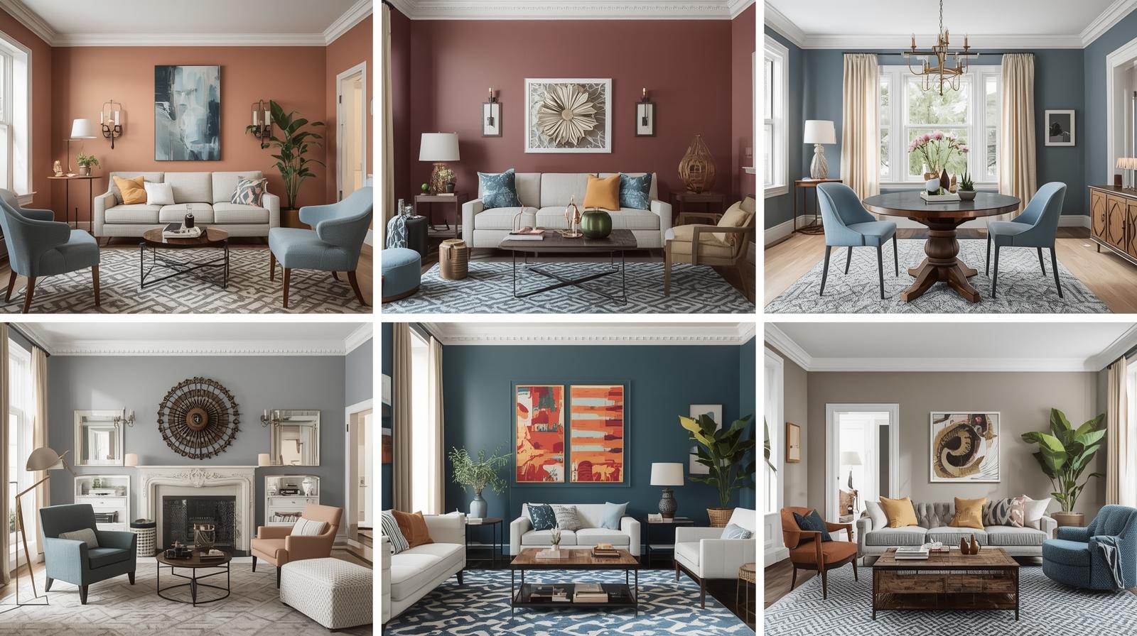
Classic Two-Color Combinations
Some color pairs have proven their worth across decades and design styles. These classic combinations provide reliable starting points for any room.
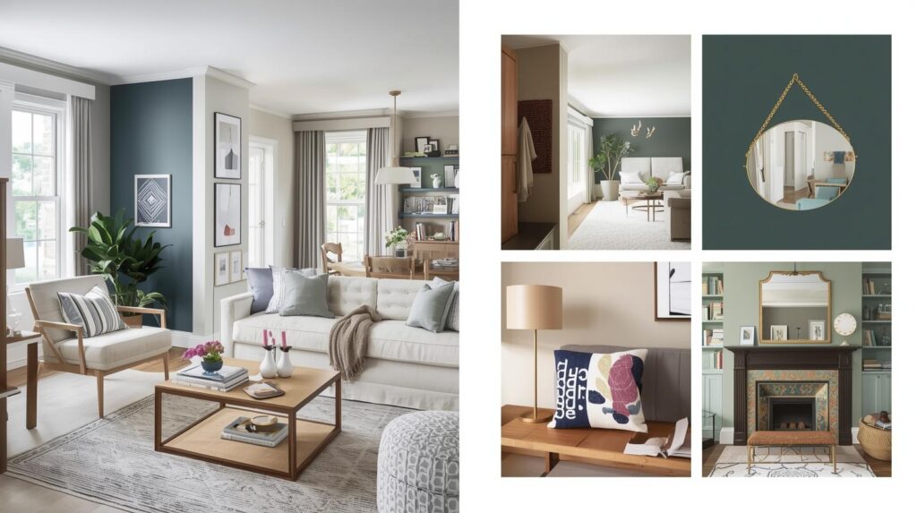
Blue and White
Blue and white may be the most timeless color combination in interior design. The pairing evokes clear skies, coastal landscapes, and classic ceramics from around the world. It works in virtually every room and adapts to any style from traditional to modern.
In a living room, navy walls with white trim and white upholstery create dramatic, sophisticated spaces. In a bedroom, pale blue walls with crisp white bedding feel fresh and serene. In a kitchen, white cabinets with blue island and blue accessories add personality without overwhelming.
The versatility of blue and white comes from the endless range of blues available. Pale sky blues feel airy and calm. Medium blues add presence and sophistication. Deep navies create drama and intimacy. Each works beautifully with white.
Gray and Yellow
Gray and yellow has become a beloved combination for its perfect balance of calm and energy. Gray provides sophisticated neutrality while yellow adds sunshine and optimism. The combination works beautifully in spaces where you want both tranquility and warmth.
In a living room, warm gray walls with yellow accent pillows and throws create welcoming spaces that feel both cozy and cheerful. In a kitchen, gray cabinets with yellow accessories add personality without commitment. In a bedroom, soft gray walls with pale yellow bedding create serene, uplifting spaces.
The key to successful gray and yellow combinations lies in choosing the right shades. Warm grays with brown undertones pair beautifully with buttery yellows. Cool grays work better with lemony yellows. Test combinations in your space before committing.
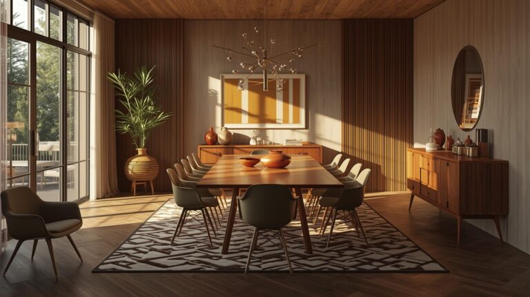
Green and Brown
Green and brown brings the colors of the natural world indoors, creating spaces that feel grounded, calm, and connected to nature. This combination works particularly well in rooms where relaxation is the goal.
In a living room, sage green walls with chocolate brown leather furniture create cozy, inviting spaces perfect for conversation. In a bedroom, soft green walls with natural wood furniture and brown textiles feel like a forest retreat. In a home office, green and brown promotes focus while maintaining connection to nature.
The range of greens and browns available allows for endless variation. Pale greens with light woods feel fresh and airy. Deep forest greens with rich mahogany feel luxurious and intimate. Choose combinations that reflect the mood you want to create.
Navy and White
Navy and white offers the crisp, clean appeal of blue and white with added sophistication and drama. This combination feels both classic and contemporary, working in traditional and modern spaces alike.
In a dining room, navy walls with white trim and white linens create dramatic, elegant spaces perfect for entertaining. In a bedroom, navy bedding against white walls feels crisp and tailored. In a kitchen, navy lower cabinets with white uppers and white countertops create balanced, sophisticated spaces.
Navy and white works particularly well with natural materials like wood and rattan, which add warmth to the cool combination. Brass accents add glamour and sophistication.
Black and White
Black and white is the ultimate high-contrast combination, creating dramatic, graphic spaces that never go out of style. This pairing works in spaces where you want impact and sophistication.
In a living room, black and white patterns in textiles and artwork against white walls with black accents create spaces that feel curated and intentional. In a kitchen, white cabinets with black countertops and black hardware feel modern and timeless. In a bathroom, black and white tile creates classic, elegant spaces.
The key to successful black and white combinations lies in texture. Without color to provide interest, texture becomes essential. Matte and gloss finishes, woven and smooth materials, patterned and solid surfaces all add depth to black and white schemes.
Three-Color Combinations
Adding a third color creates more complex, nuanced schemes with greater personality.
Blue, White, and Wood
This combination adds natural warmth to the classic blue and white palette. The wood introduces organic texture and warmth that prevents the scheme from feeling too cool or clinical.
In a living room, blue walls, white upholstery, and a wood coffee table with wood accents create balanced, inviting spaces. In a bedroom, blue bedding, white walls, and natural wood furniture feel fresh and grounded. In a kitchen, blue cabinets, white countertops, and wood open shelving combine for collected, personal spaces.
The wood can range from pale ash to rich walnut, each creating a different effect. Pale woods keep spaces light and airy; dark woods add drama and sophistication.
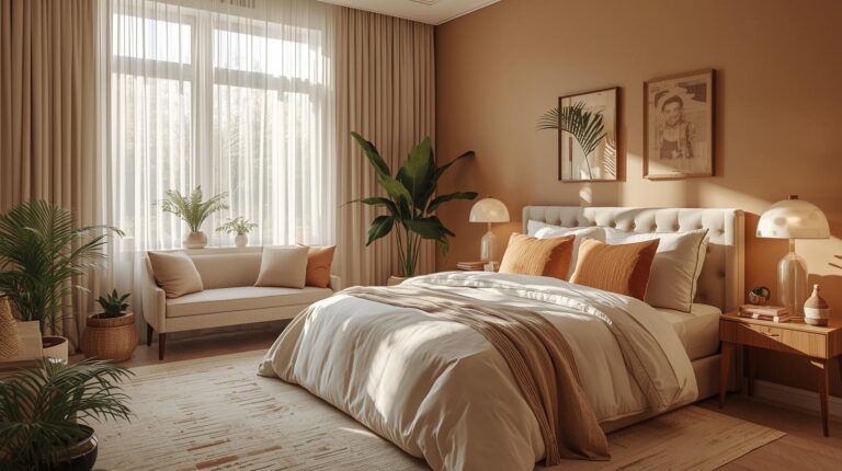
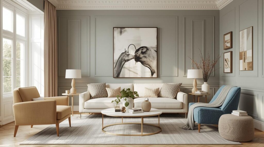
Gray, White, and Blush
This soft, feminine combination has gained popularity for its ability to create spaces that feel both sophisticated and approachable. Gray provides neutral foundation, white adds freshness, and blush introduces warmth and softness.
In a living room, gray walls, white trim, and blush accents in pillows and throws create welcoming spaces with subtle color. In a bedroom, blush bedding against gray walls feels romantic without being overwhelming. In a nursery, this combination works beautifully for any gender.
The key lies in choosing blush with the right undertone. Peachier blushes work with warmer grays; pinker blushes suit cooler grays. Test combinations to find your perfect match.
Green, Navy, and Brass
This sophisticated combination brings together two deep, rich colors with warm metallic accents. The effect is luxurious, dramatic, and thoroughly contemporary.
In a living room, navy walls with green velvet upholstery and brass light fixtures create spaces that feel elegant and intentional. In a dining room, green walls with navy trim and brass chandeliers set the stage for memorable entertaining. In a home office, this combination promotes focus while feeling special.
The brass adds warmth that prevents the deep colors from feeling heavy. Polished brass feels glamorous; antique brass adds vintage character.
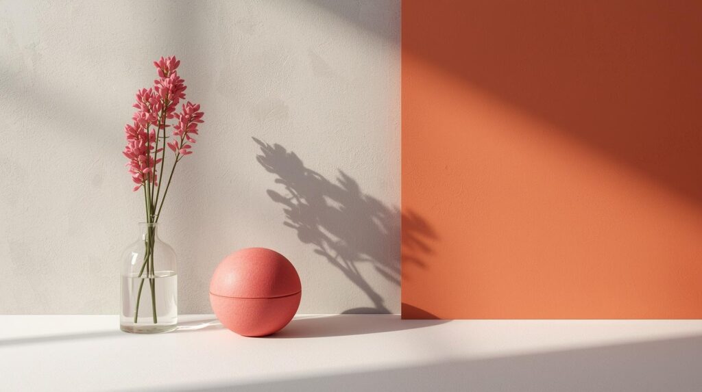
Terracotta, Cream, and Sage
This earthy combination draws from the natural landscape, creating spaces that feel grounded, warm, and connected to the outdoors. Terracotta brings warmth, cream adds softness, and sage contributes calm.
In a living room, terracotta accent wall with cream sofas and sage green pillows creates welcoming, organic spaces. In a bedroom, cream walls with terracotta textiles and sage accents feel like a desert retreat. In a kitchen, sage cabinets with terracotta tile and cream countertops combine for warm, inviting cooking spaces.
Natural materials like wood, stone, and woven textures enhance this earthy palette. Plants add life and reinforce the connection to nature.
Room-by-Room Color Combinations
Different rooms invite different color approaches based on function and mood.
Living Room Combinations
Living rooms accommodate various activities from quiet reading to lively entertaining. Versatile combinations that adapt to different moods work best.
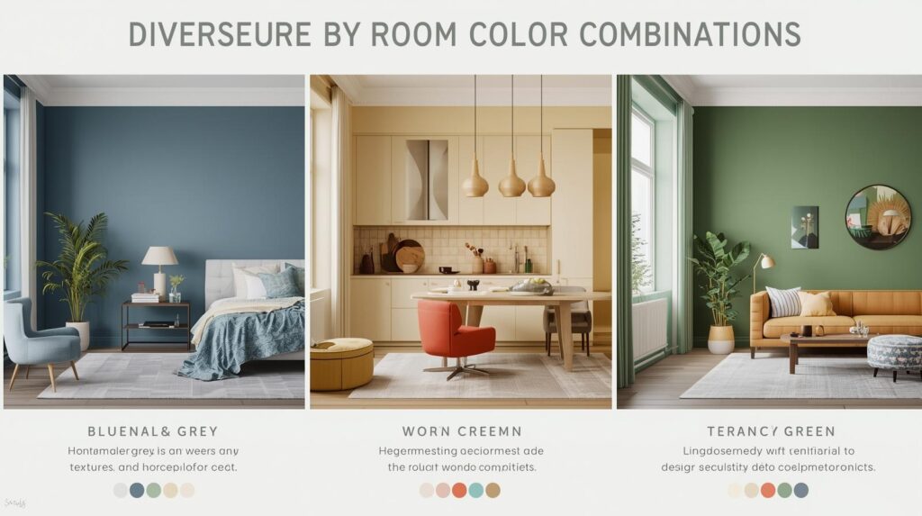
Consider warm gray with navy accents for spaces that feel both calm and intentional. Sage green with cream and natural wood creates relaxed, organic spaces perfect for family life. Charcoal with blush and brass offers drama with softness for more formal living areas.
Kitchen Combinations
Kitchens benefit from combinations that feel clean and fresh while allowing personality to shine.
White with navy and brass creates classic, sophisticated cooking spaces. Sage green with cream and wood feels fresh and natural. Gray with white and yellow adds energy and optimism to morning routines.
Bedroom Combinations
Bedrooms should promote rest while reflecting personal style. Soft, calming combinations work best.
Pale blue with white and cream creates serene, spa-like retreats. Lavender with gray and white offers soft romance. Warm gray with blush and wood feels cozy and welcoming.
Bathroom Combinations
Bathrooms invite combinations that feel clean and spa-like while handling moisture appropriately.
White with blue and natural wood creates fresh, coastal-inspired spaces. Gray with white and brass feels sophisticated and timeless. Green with cream and stone connects to nature while promoting relaxation.
Using Neutrals in Color Combinations
Neutrals provide the foundation for countless successful color combinations.
White as Foundation
White works with virtually any color, providing fresh, clean backdrops that allow other hues to shine. It reflects light, making spaces feel larger and brighter. In color combinations, white provides breathing room between more intense hues.
Gray as Versatile Neutral
Gray offers more complexity than white, adding sophistication while remaining neutral. Warm grays complement earthy colors; cool grays suit brighter, cleaner palettes. Gray works as wall color, furniture finish, or accent.
Beige and Greige
Beige and greige provide warmth that white sometimes lacks. These neutrals work beautifully with earthy colors and create cozy, inviting spaces. They pair particularly well with blues, greens, and terracotta tones.
Black as Anchor
Black grounds color combinations, providing contrast and definition. Used sparingly, it adds sophistication without heaviness. Black works particularly well in combinations with white, navy, and jewel tones.
Testing Your Color Combinations
Before committing to any combination, proper testing prevents costly mistakes.
Gather Samples
Collect paint chips, fabric swatches, and material samples of all colors in your proposed combination. View them together in your space at different times of day. Natural and artificial light both affect how colors relate.
Create Mock-Ups
Paint large samples on your walls and position fabric samples nearby. Live with these mock-ups for several days, observing how the combination feels at different times and in different moods.
Consider Proportions
Remember that the 60-30-10 rule applies. Your samples may look different in the actual proportions you will use. Visualize how the combination will work with your planned distribution of colors.
Trust Your Response
After all the theory and testing, trust how the combination makes you feel. The right colors should bring you joy every time you see them. If a combination that works on paper does not feel right in your space, honor that response.
Conclusion: The Art of Color Combining
Color combinations for the home represent both science and art. Understanding color theory provides the foundation, but your personal response to color matters most. The combinations that feel right to you, that make you happy every time you walk through the door, are always the right choices.
Whether you prefer classic blue and white, sophisticated gray and blush, earthy terracotta and sage, or dramatic navy and brass, let your color choices reflect your personality and support how you actually live. A beautiful combination that does not work for your life is not beautiful at all. The best schemes are those that serve you daily.
Take time with your color decisions. Consider how each room functions, how light affects the space, how combinations transition throughout your home. Test thoroughly and trust your instincts. The result will be a home filled with colors that work together, that support your life, that feel like you.
Color combinations transform houses into homes. Choose wisely, and your spaces will welcome you for years to come.